The Lovely Grid of Sudoku by Bellini
Sudoku is a game I don't enjoy, but I don't get much out of numbers all on their own. I like them as purely aesthetic objects, as in Charles Demuth’s painting The Figure 5 in Gold-beyond that, they puzzle me (that pun is intended). I prefer the realm of letters, which explains my inclination towards Scrabble, crosswords, and word searches. Sudoku, in my mind, is like a crossword puzzle without the proper ingredients. Despite my negative feelings about the mathematical/logic game, I do like its namesake bookshelf designed by Mario Bellini for Horm.
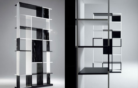
Sudoku Nerobianco and Sudoku. Designer by Mario Bellini for Horm.
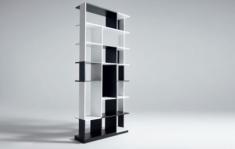
Sudoku is a black and white structure constructed of wood or polished aluminum. The aluminum version is sleek and shiny; the wood version is textural and striated-both are black and white. The design of Milanese architect Mario Bellini, Sudoku measures approximately 38 x 10 x 77 inches. The appeal of Sudoku may be its dualistic nature, which lends itself to a certain collection: graphic novels, black and white photography, old newspapers, and novels with white and black in their titles (The Woman in White by Wilkie Collins, Black Beauty by Anna Sewell). You can also use Sudoku's shelves to set off some color-showcase only books with orange spines, for instance. Alternatively, you might use Sudoku to store other objects: a collection of trolls, a menagerie of porcelain zoo animals, a stockpile of antique glass jars. The grid-which is the only thing I actually like about Sudoku puzzles-anchors the bookshelf's design, allowing you to make a great composition out of virtually anything.
Sudoku Nerobianco. Designer by Mario Bellini for Horm.
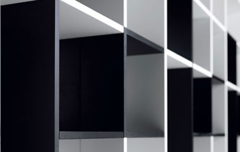
Sudoku. Designer by Mario Bellini for Horm.
Sudoku. Designer by Mario Bellini for Horm.
Via Bookshelf Blog.


Leave a Reply