Milica Nesovanovic’s Pisa Tower
If you haven’t been to the Leaning Tower of Pisa yourself, you’ve surely seen the all-to common photos of tourists single handedly ‘pushing’ the tower over. The campanile, or freestanding bell tower, of the cathedral of the Italian city of Pisa has been leaning southeast since the onset of construction in 1173. Despite its axis being a bit angled, its construction is stable and secure nonetheless – and this quirky characteristic has made it a much more popular tourist destination than it would have been as a perfectly vertical tower (as designed).
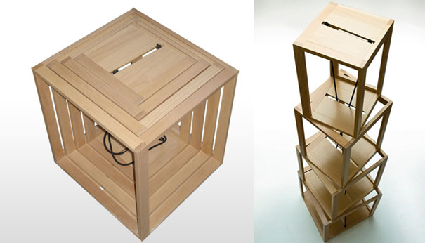
Pisa Tower. Designed by Milica Nesovanovic.
Milica Nesovanovic’s nested boxes find inspiration in this stable-yet slanted form, hence their name, the Pisa Tower. The boxes are a multi-functional product that can easily transform into a shelf or desk. By removing the boxes from the core and slightly turn each, you’re building the levels of the shelf. A single elastic strip connects runs through a central slit in each of the boxes, connecting them to one another. Production is fairly simple since the box element is a basic wooden frame.

Nesoanovic’s nested boxes won the prize for from ULUPUDS-a ( Serbian art and design sociaty ) for a signle piece furniture and group prize for invention and design of products with collegues from “Sector of wood procesing” Belgrade located faculty ( Šumarski faklutet ) at the 47th Belgrade Furniture Fair.
This is yet another addition to the ever-increasing collection of ‘expandable’ bookshelves chronicled on 3Rings: REK’s expandable bookcase and Kaspar Hamacher’s Leather Belt bookcase.
via designeast.eu


Leave a Reply