Ismail Özalbayrak’s Wireframe Table
Like Andy Kem’s Breakplane and Casulo’s Life in a Box, Ismail Özalbayrak’s Wireframe table has a flatpack aesthetic. The piece is an excellent exercise in minimalist aesthetics—from conception to final product, from choice of materials to ease of assembly, Ismail’s table speaks the language of wise resource use and smart design. While the piece isn’t actually specifically designed for rapid disassembly and transport, it seems to me that it could be refined as such (Ismail is actively soliciting a manufacturer for the piece, so perhaps now’s the time for such conceptual nudges).
Wireframe Table. Designed by Ismail Özalbayrak.
On the prospect of the above, I’d like to see Wireframe with a broad range of color choices. The extant version—black painted steel and white MDF—is a classic look whose vertical orientation recalls the art deco architectural ornamentation of the 20s, but perhaps a bit of fooling around with a more vibrant color scheme would increase the marketability of the piece: lime on chocolate might draw the eyes (or the ire) of aficionados, or perhaps a cream contrasted with earthy tones of reds and oranges could jazz it up a bit.
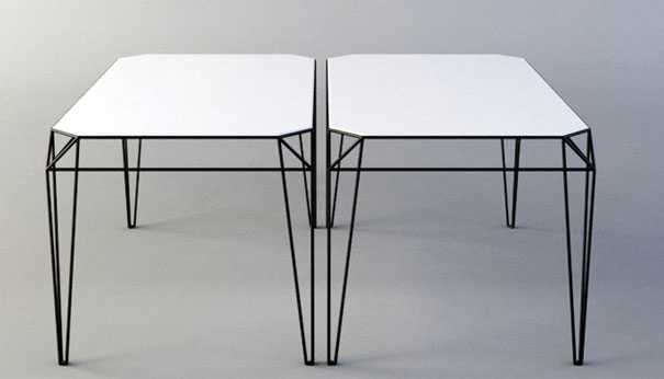
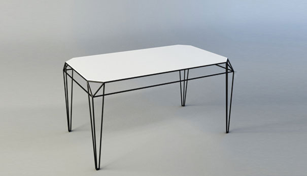
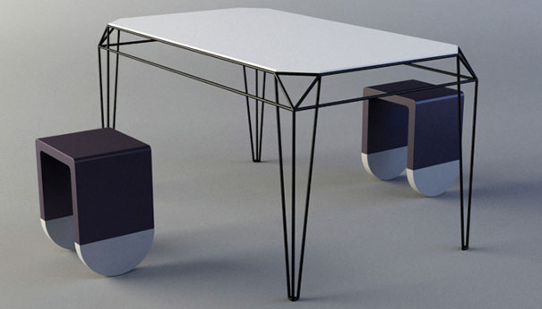
Ismail is still a student in Hamburg, but Wireframe represents an auspicious debut. Beyond the aforementioned minimalism, the table embraces negative space in a way that gives it a tremendously versatile aesthetic. In its current colors, it would nicely complement the sleek modernity and cool palette of the recent Corian Collection by Eggersman. Soon to be featured in Marc Praquin’s book, The Design And Design Book Of The Year Volume 3, Wireframe will not be long in coming to a manufacturer near you.
Pics from DesignMilk.



Leave a Reply