Roca Ceramica’s Millenium Tiles
You’ll be hardpressed to find an image of Audrey Hepburn in a bright shade or bold pattern. Even Marilyn Monroe’s most iconic photo is shot of her in a white dress. Catching on? Neutral shades: white, cream and black, are simple, sophisticated and timeless (oftentimes sexy too). But like everything, there’s a right way and a wrong way (forget what they told you when you were a kid).
Millenium Tiles. Designed by Roca Ceramics.
Beauty lies in simplicity – not blandness. With neutrals and monochromatics, texture and form become increasingly important – whether you’re talking fashion or interiors. Roca Ceramica’s Millenium collection showcases two hues in a classic ribbed pattern. In blanco and platino, horizontally or vertically oriented, Millenium can create a series of simple yet sophisticated designs. Even more, the tiles fit together seamlessly.
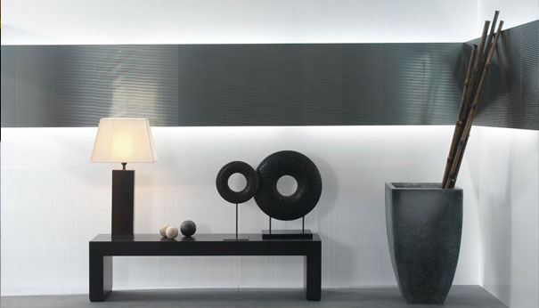
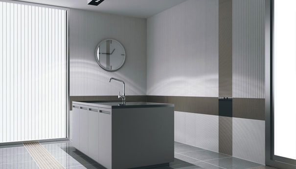
From Ann Sacks‘ three-dimensional, burnt red Dahlia tiles and rose mosaic, Beau Monde to Studio Art’s bold Omni leather tiles, there is obviously a wide array of vibrant options for the walls and floors. While most of us may appreciate these brightly colored creations, sometimes it’s better to have something a bit more subtle. If it’s an area you’re living with day-to-day, neutral is often better (at least for me). You’re unlikely to grow tired of the Millenium collection – and it can be altered to fit personal style and taste. Splashes of color can exist in accessories, which can be much more easily rotated or replaced.
Another monochromatic tile we love is Lea Ceramiche’s Progetto L14 collection – using texture and form to make an otherwise simple tile create a sculptural aesthetic.

Leave a Reply