Exploring the Pattern Map: a Conversation with Uriah Bueller of Parasoleil
Think for a second about “pattern.” Now before doing anything else, create for yourself a compact, concise definition. Done? Make a mental note of yours. Mine goes something like this: “a decorative design with repeated elements.” Pretty close to the dictionary definition, “a repeated decorative design,” and fine, perhaps, if you’re just picking out a textile for your mother-in-law, but as any linguist will tell you, language has its failings—one of which is the inability to really get at terms like “pattern.” Or perhaps the failing isn’t to be found in the inability to do this (explore the essence of “pattern”), but rather in the pretense to such, the notion that language might actually be capable of exploring it, because pattern isn’t merely a problem for words to solve.
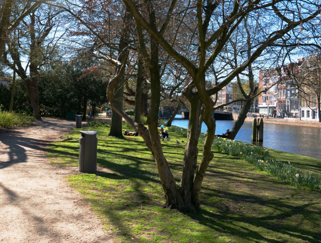
No textiles in sight. Is this still a pattern? Photo by Fons Heijnsbroek on Unsplash
Now look around. Examine the light that falls on your wall. Engage with the swoosh of your dog’s tail. Open the door to your backyard. See the intricate tangles of your in-need-of-a-trim hackberry. Witness the raindrops that drip to their demise in the sea of Kentucky bluegrass below. “Oh my God!”, you should now gesticulate, “Patterns are everywhere, not just in the neat checkerboards on my bed sheets!”

Patterns in nature defy the idea of repeated elements, but here the density of the trees and the reflection of mountain and clouds create an illusion of order.
Uriah Bueller, Founder and CEO of architectural panel systems manufacturer Parasoleil, makes a persuasive case that the idea of pattern contains multitudes, an excess of multitudes, so many multitudes, in fact, that Bueller was inspired to create the “Pattern Map”—a concept that at first glance may look like a dreaded trig problem, but in fact lies at the nexus of math and art.
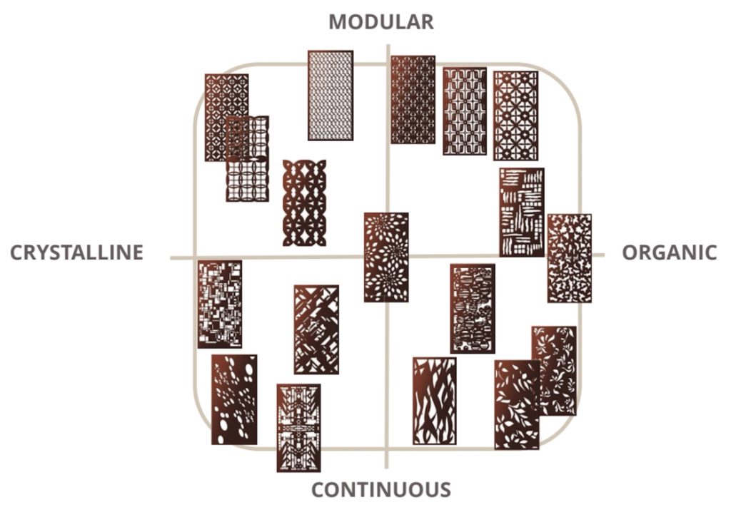
Yes, this involves a Y-axis and an X-axis. But before you go rolling your eyes and back to your Instagram feed, bear with me and with Bueller, because it’s quite compelling, and it will give you a whole new way to talk about what pattern is and why one would want to know. The Pattern Map works like this: Along the X (left and right), we have types of shapes—“crystalline” (straight lines and simple circles) to the left and “organic” (unpredictable shapes that defy geometry) to the right. On the Y (up and down), we have frequency of repetition—“modular” (endless repetition) up top and “continuous” (absence of repetition with a defined focal point) on the bottom. Each pattern falls into one of the four quadrants sketched out by the axes, meaning patterns are either crystalline-modular, organic-modular, crystalline-continuous, or organic-continuous. Another way to think of this is to compare the patterns most frequently associated with the built environment (crystalline-modular), to those found throughout nature (organic-continuous in general with certain exceptions).
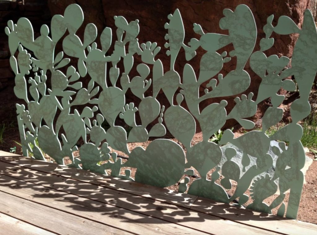
This Parasoleil panel, “Anderson Ranch” is continuous organic. It’s fairly abstract yet evokes natural forms, particularly the Prickly Pear cactus.
Think back to that hackberry with the rain dripping off it. Now compare it to the façade of your house.
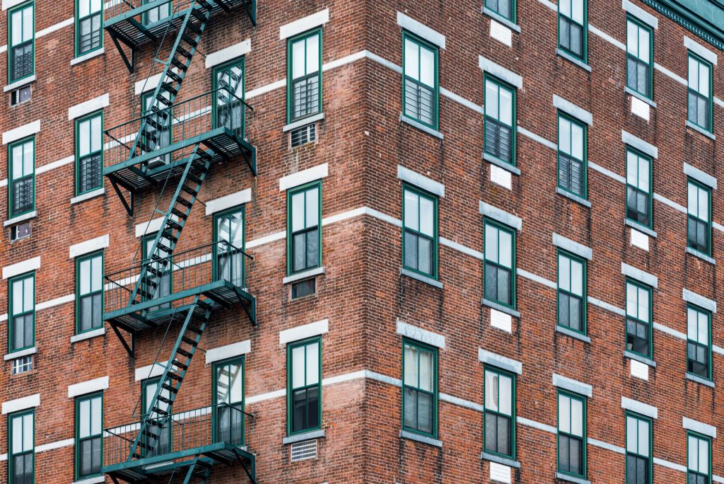
A typical example of crystalline modular architecture: all repetition and hard right angles
Hopefully, you’re beginning to get the picture. The Pattern Map is a way of codifying pattern by putting us in touch with the difference between the patterns we typically manufacture versus those found in nature, and the ways in which they dialogue and intersect. At the core, it’s an attempt to create a lexicon around not only what pattern is but how it makes us feel. For Bueller, this is the crux of the issue: “It just makes sense to have a shared vernacular to be able to talk about pattern constructively. This way, I can actually explain it to architects rather than just use abstractions like “residential” or “industrial.”
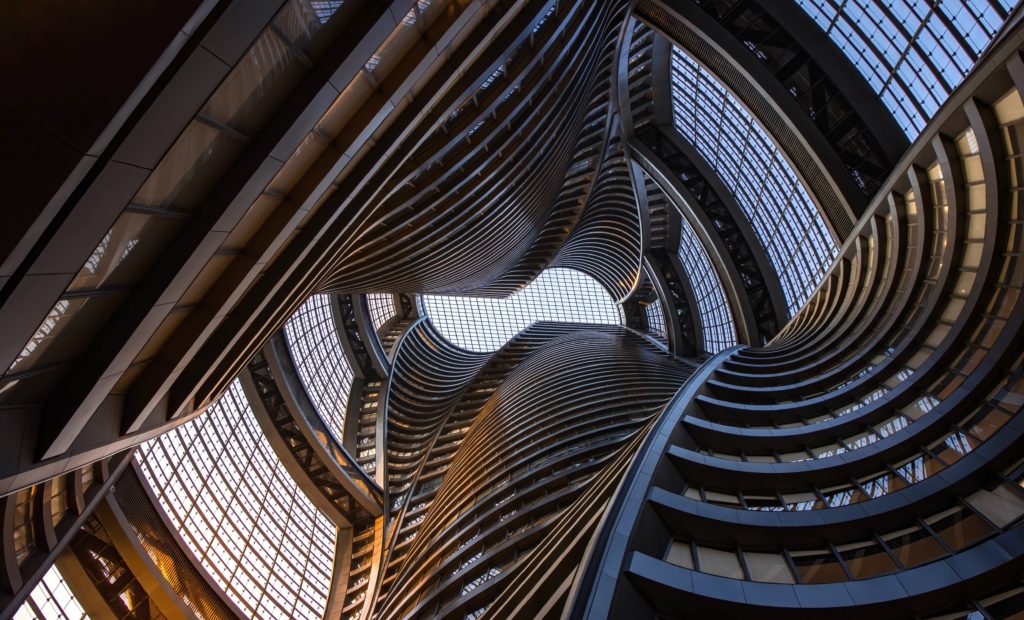
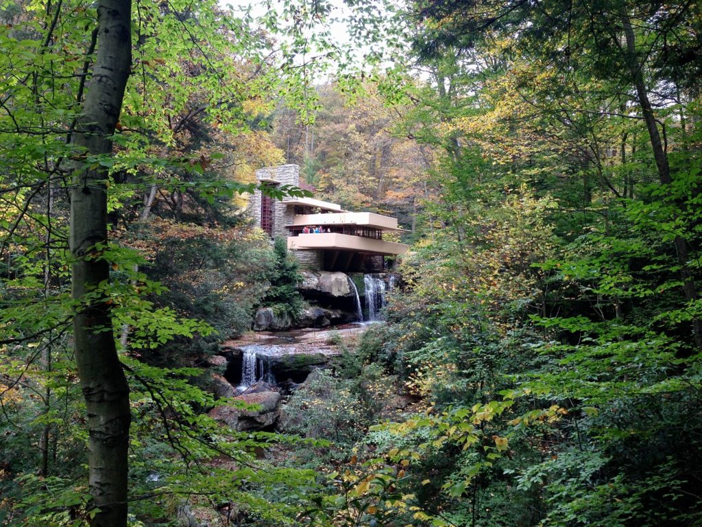
Architecture by Zaha Hadid and Frank Llloyd Wright. Are these “industrial?”, “residential?” Or do we perhaps need better terms? Photo above by Vincent Lin on Unsplash and below by Tim Wildsmith on Unsplash.
Establishing nature as the default—“the through-line that all architecture is built from,” says Bueller—is a good place to start the conversation since people intrinsically prefer shapes rooted in nature, even though they may not realize it. Having this discussion about natural forms vs. the crystalline/modular patterns that define most architecture gives clients some theoretical footing to understand, for instance, how powerful it can be to incorporate organic shapes: “Our sculpture is about filtering light and framing space, helping to define what we can get out of these biophilic elements.”
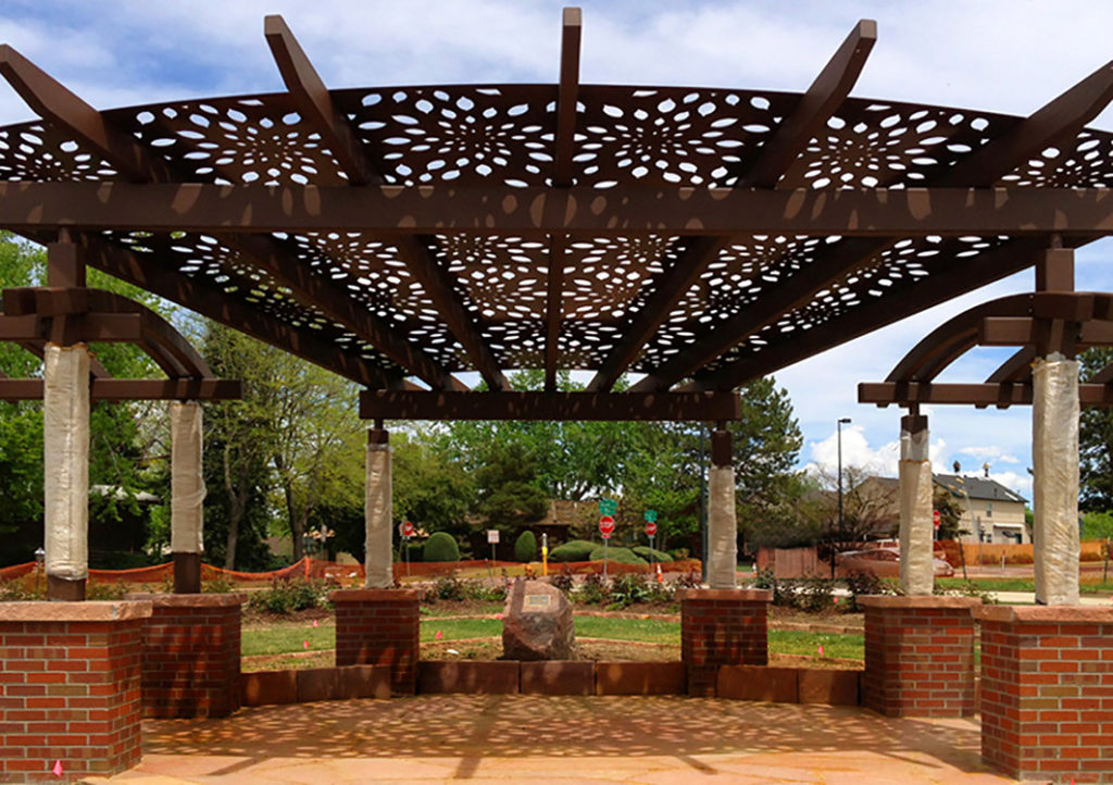
Parasoleil architectural panel with a Lemon Drop pattern. The overhead structure filters light with organic shapes in a repeating motif: a pleasant synchrony with the surrounding crystalline infrastructure.
Parasoleil’s patterns run the gamut, from the modular-crystalline of “Bronx Blue” to the sublimely indefinable biophilia of “Regent’s Park,” yet categorizing the pattern isn’t the point. The larger aim is to create the tools to explain the effect a certain pattern is likely to have and how it will dialogue with all the other elements of a space: the architectural language of adjoining or proximal structures, the nature of the light, the weather, even the pattern’s situation into the larger spatial lexicon of a city block.
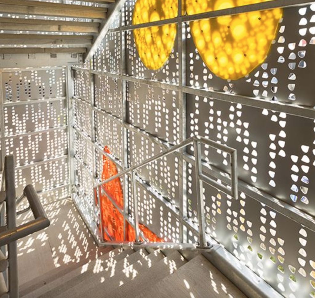
This stairwell in a Denver apartment complex is enclosed with custom Parasoleil panels. Experienced form the inside it functions similar to a Mashrabiya screen, providing a sense of enclosure and a connection to the outdoors. Seen from the street, it’s public art.
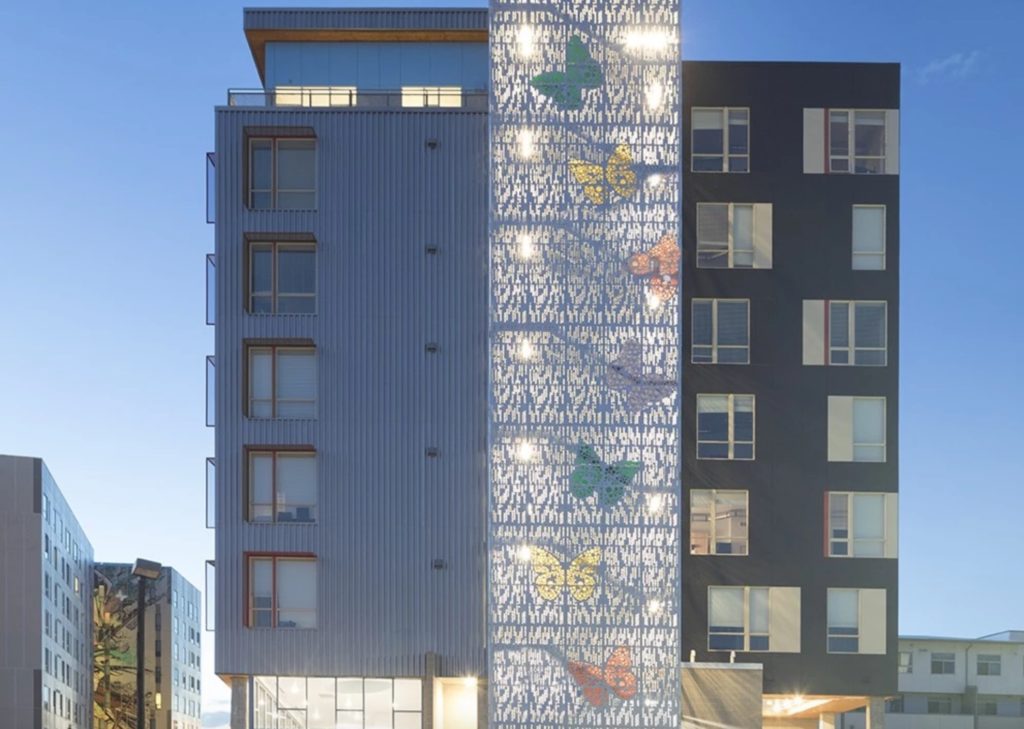
Generally speaking, modular patterns are easily apprehended, and thus offer a sense of safety. Bueller cites the example of a sea of grass. If this pattern is unbroken (exclusively modular), it will feel familiar, non-threatening, but when we incorporate a continuous element (a glowing pair of eyes staring back at us, for instance), we instinctively gravitate to the break as a focal point. It’s like a magnet for our senses that evokes a sympathetic response: “The point is to engage this balance between chaotic nature and organized form… We want to apply that same instinct to architecture and how people react to spaces.”
Perhaps this is a good time for some bullet points.
Modular/Crystalline:
- Simplest patterns
- Blend into the architecture
- Structurally predictable
Modular/Organic:
- Incorporate nature while maintaining structure and order
- Familiar pattern that can make spaces seem more welcoming
Continuous/Crystalline:
- Architectural focal point
- Balance design vernacular of the structure with a branding element
- May create optical illusions
Continuous/Organic:
- Incorporate biophilic language of nature
- Create a focal point
- Decorative, unpredictable art as a welcome counterpoint for the sometimes-sterile language of architecture
This simple rubric helps illustrate why the pattern map matters. Bueller cites the example of a client who’s fond of a particular continuous organic pattern. However, the particular pattern at the scale required would seem overwhelming and jarring and possibly run the risk of becoming dated. Using the concepts outlined in the pattern map, Bueller can propose a compromise.
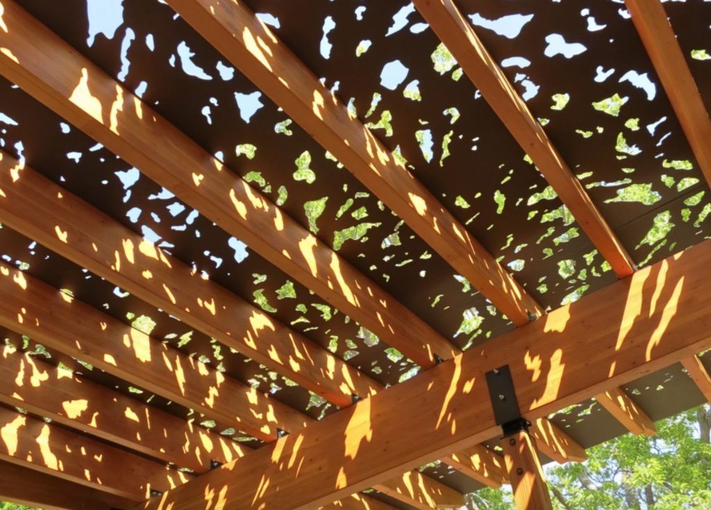
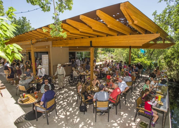
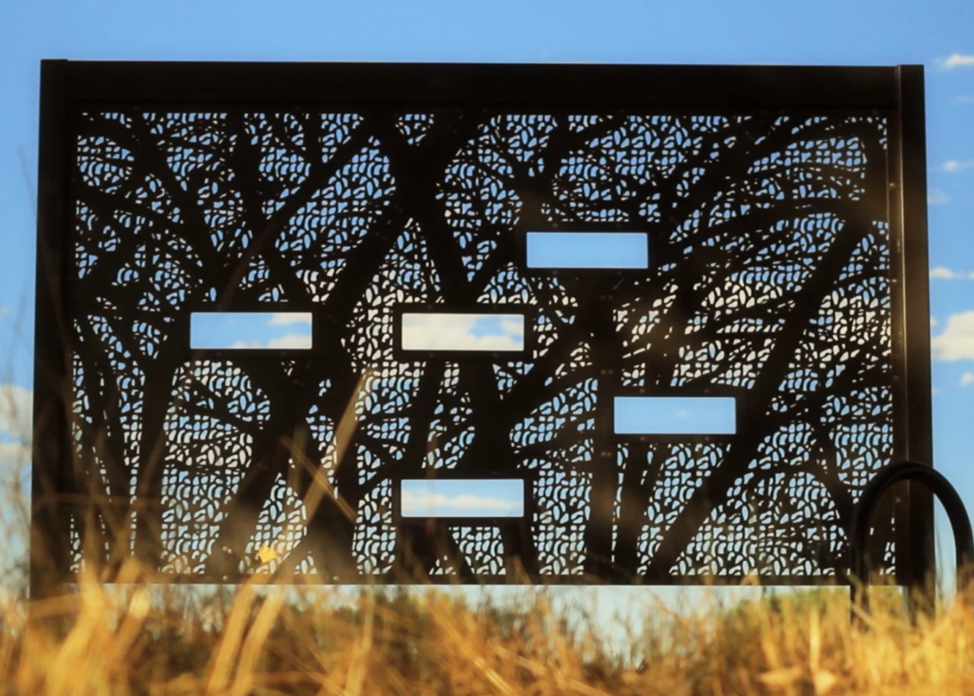
Winter branches in summer light. This Parasoleil panel, “Winter Branches,” is a continuous organic pattern: “Casting organic shadows on the ground, table tops, and even the vertical surfaces of the overhead support beams, it envelopes the garden’s patrons in a play of light and shadow that both shelters and changes with the passing of the sun—bridging the experience to other areas of the garden.”
Consider the image below. The base pattern is modular organic (look closely and you’ll see that the shapes are asynchronous and unpredictable), yet at such a large scale it could really use a focal point to create visual interest and break the monotony. MESH (an acronym for “Modular Engineered SHadowgraphic patterns) integrates one pattern with another. In this case, the organic, continuous tree interrupts the sameness of the modular pattern. Together, they tie-in with the existing structure while providing a dramatic focal point that also incorporates biophilia. Says Bueller, “Meshing it together is so much fun because we take all these academic elements and all of a sudden we make it very practical… maybe the tree is public art, maybe it’s the corporate brand, it could be a focal point, it could be for wayfinding, it could be a signpost that needs to be seen from the train station a quarter-mile away, especially if this is lit from the inside.”
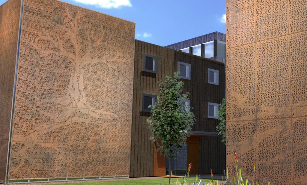
Modular-organic and continuous-organic elements playing nice together
Of course, passersby, and even users of the space, are likely to be fairly oblivious to all that’s going on behind the scenes—these “academic” notions of what our brains are wired to expect and desire and how having those expectations met or confounded triggers a cascade of emotions that we can tie to abstractions like “comfort” or “awe.” And this doesn’t even begin to engage the more pragmatic consequences of a Parasoleil panel in its use as exterior cladding, or a rainscreen, or a security fence—considerations like air modulation, temperature control, manipulation of shadow and light, not to mention establishing parameters for exposure, enclosure, and privacy concerns.
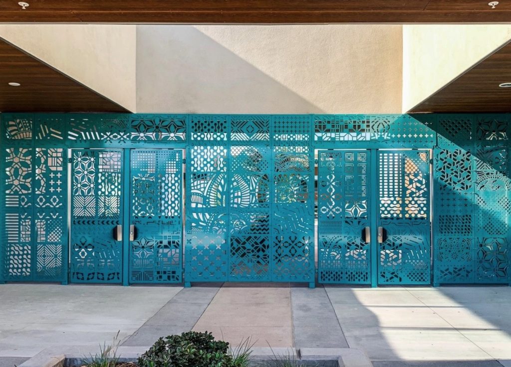
Main entry gate at the Logan TK-12 Education Complex in San Diego. Suffice it to say there’s a lot going on here: custom designs to reflect the cultural vernacular of a historic neighborhood, modulating light, and an element of security that doesn’t feel too severe or prohibitive.
If you haven’t noticed by now, Bueller apprehends lots of moving parts in the development of a panel. The previous list gives a sense of how these factors go way beyond one’s intuitive response to a pattern, but, he reasons, if we can start by parsing the intuitive response, we can make more holistic decisions that can help contribute to public well being.
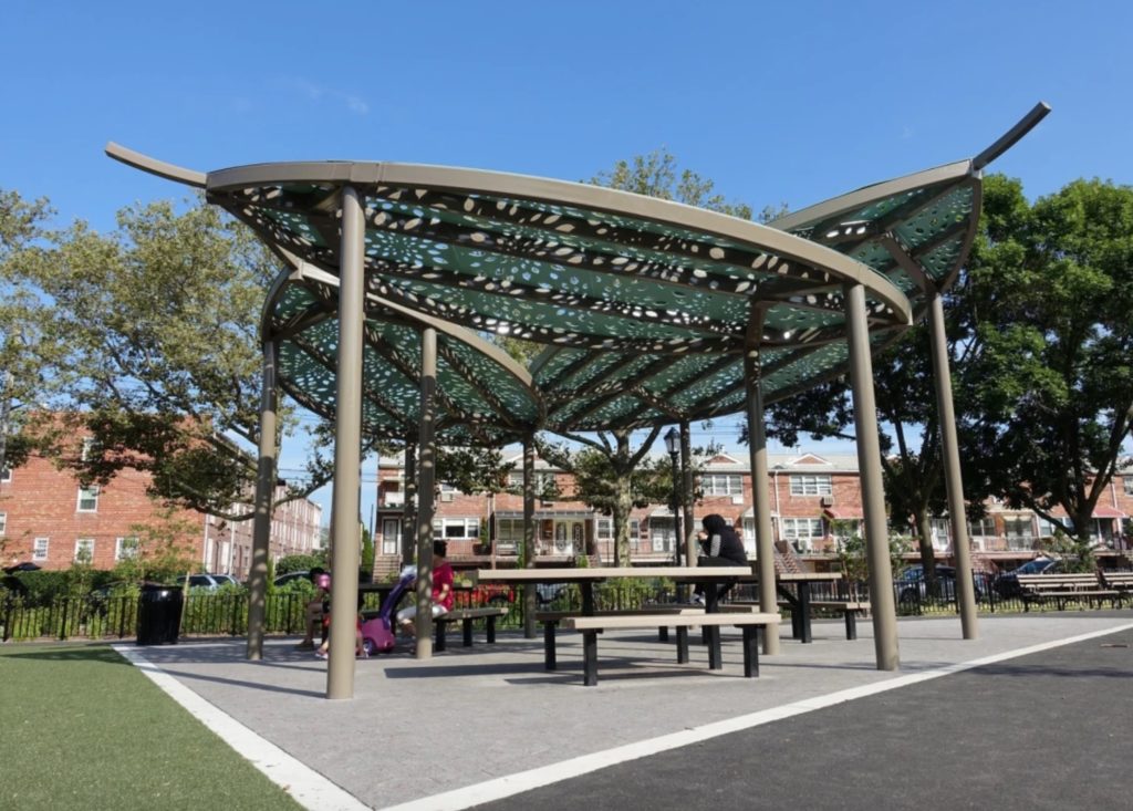
A shade structure at the Lafayette Playground in Brooklyn: a publicly funded project providing “maximum shade coverage, airflow, and a welcoming shadow pattern.”
Here’s another project to help illustrate. Parasoleil was contracted by Gensler to design the pattern that would help expand the footprint of the Arizona Biltmore. Bueller’s first consideration was to acquaint himself with the Biltmore Block, an iconic building material based on a Frank Lloyd Wright textile design. The hotel is built of these pre-cast blocks that were made on site from desert sand with 34 different designs based on patterns inspired by palm trees. The project maintains this connection to the local landscape by linking the new pattern with the existing vernacular: “We had to continue the architectural language without fighting with it.” The resulting crystalline modular pattern offers enough repetition so it doesn’t become a focal point—and thereby detract from the effect of the original architecture—yet the holes are still small enough to offer a sense of privacy.
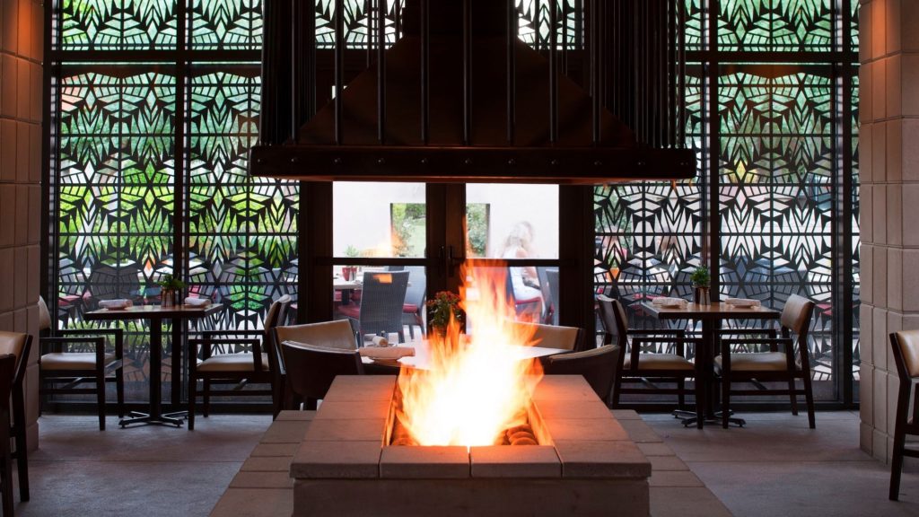
Interior view of custom Parasoleil panels at the Arizona Biltmore
Again, this minutia likely passes under the nose of most users of the space. It’s also synergistic. Bueller modestly says that Parasoleil’s panels are never the sole “make or break” element in the success of a space. Regarding the Biltmore dining room enclosed by his screens, he says “people sitting in that space are going to care as much about the service, the light, the art, the glow of the fire… I don’t think anyone’s going to walk out of there and say I love being in the dining room because of the panels.”
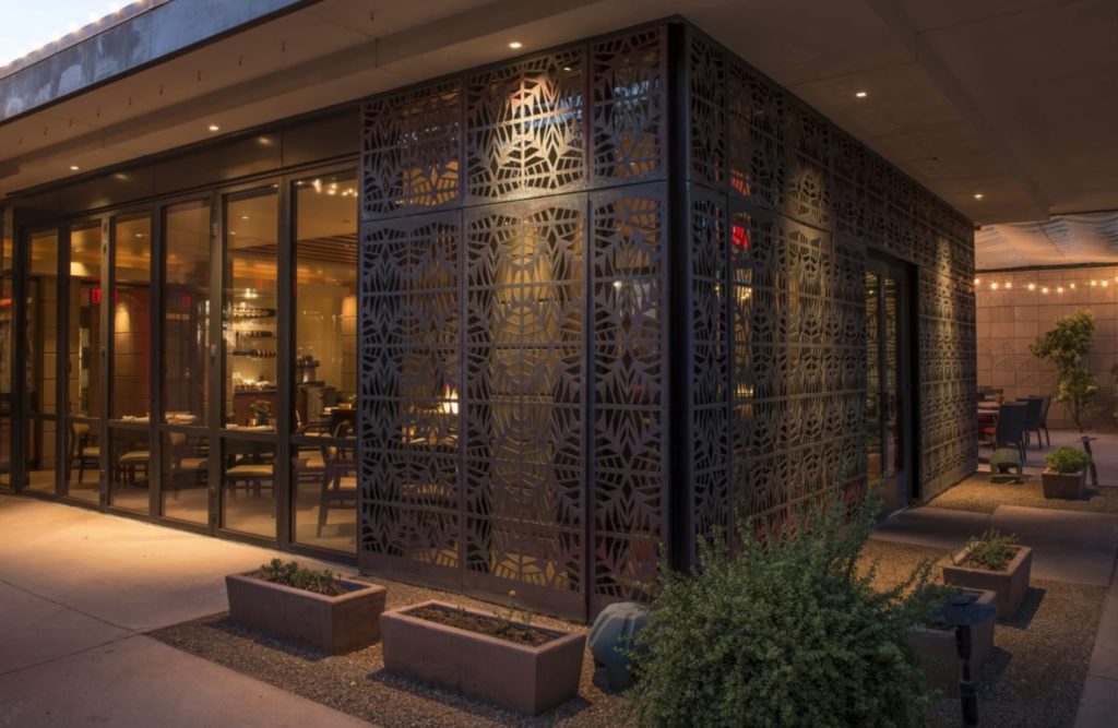
As seen from outside
Certainly, the idea of creating functional, comfortable spaces isn’t new, but perhaps the increased set of tools employed to achieve this (and quantify it) are. In this context, Bueller acknowledges that the pattern map—and all of the thought that it foregrounds and that he believes integral to creating user-friendly spaces—might be seen as esoteric: “Not everyone cares about use intent. Sometimes it’s just about making something that pops and who cares if it’s trendy in five years.” Even so, Parasoleil has done well and is looking towards a bright future. This isn’t only because their products fill expanding niches—like public art and parking garage cladding—but also because progressive architects and designers are drawn to the concept.
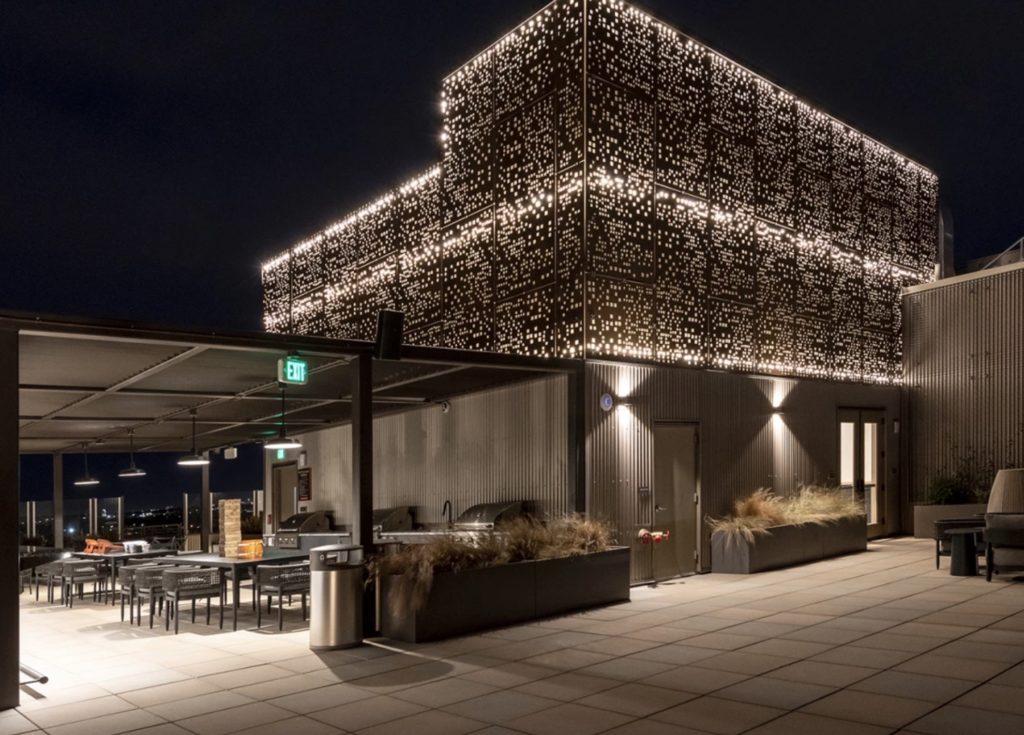
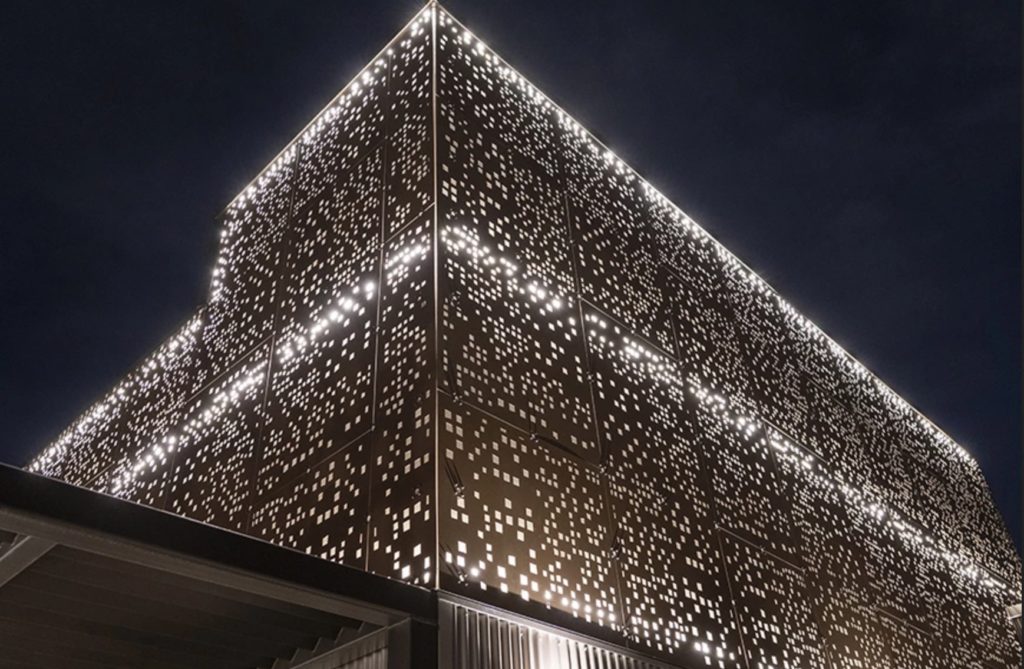
The Gotham pattern adorns the crown of a 13-story multi-family residential complex in Denver’s popular RINO neighborhood. An ornamental cladding system with integrated back-lighting creates an expressive urban aesthetic that’s engineered for high wind loads and removable for access and replacement.
Following the dictum of like follows like, these forward-thinkers approach making spaces with the same level of granularity posed by the Pattern Map. In the context of WELL certification and focusing on the health of people who use the space as much as its environmental impact, the potentially esoteric terrain of modular/organic, continuous/crystalline, etc… begins to seem approachable, enlightening, logical, even necessary: “Seeing trends like WELL expanding and growing in the design industry has been really cool… creating the right kind of light, filtering it in an artful way, lowering glare, creating spaces where people want to be… that excites me, that’s something we’ve always cared about and we’re thrilled to be a part of it.”



Leave a Reply