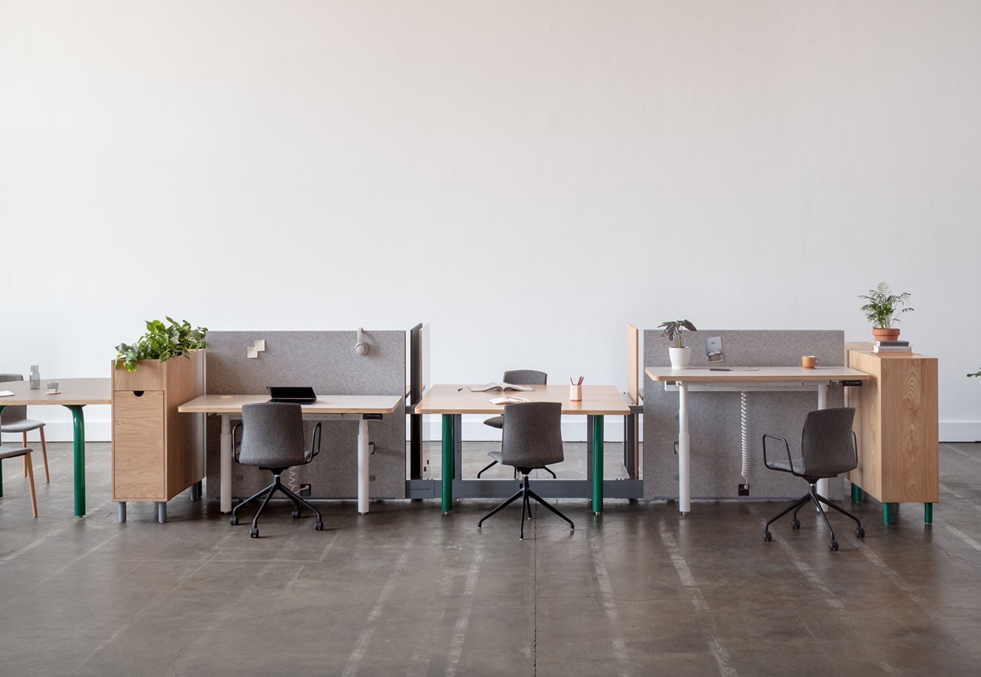
One Size Does Not Fit All: Gensler and Pair Collaborate on the Future-Forward Gradient
Though it may sound like a cliché, there’s something transcendent about connection. As quantum science has shown, even at the sub-atomic level, nothing is truly separate, everything flows into and out of everything else.
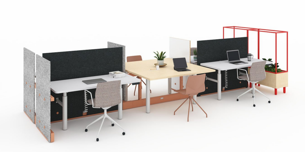
Gradient shown flowing into and out of privacy screens, variable-height desks, and storage with integrated biophilia.
Is it a leap to jump from quantum physics to commercial office furniture? The team behind Gradient—an eclectic workplace system born of an auspicious collaboration between manufacturer Pair and design firm Gensler—didn’t verbalize the metaphor for me, though they did plant the seed, first, in the obvious synergy and genial spirit they display as a group, and, second, in how they speak about the aforementioned Gradient.
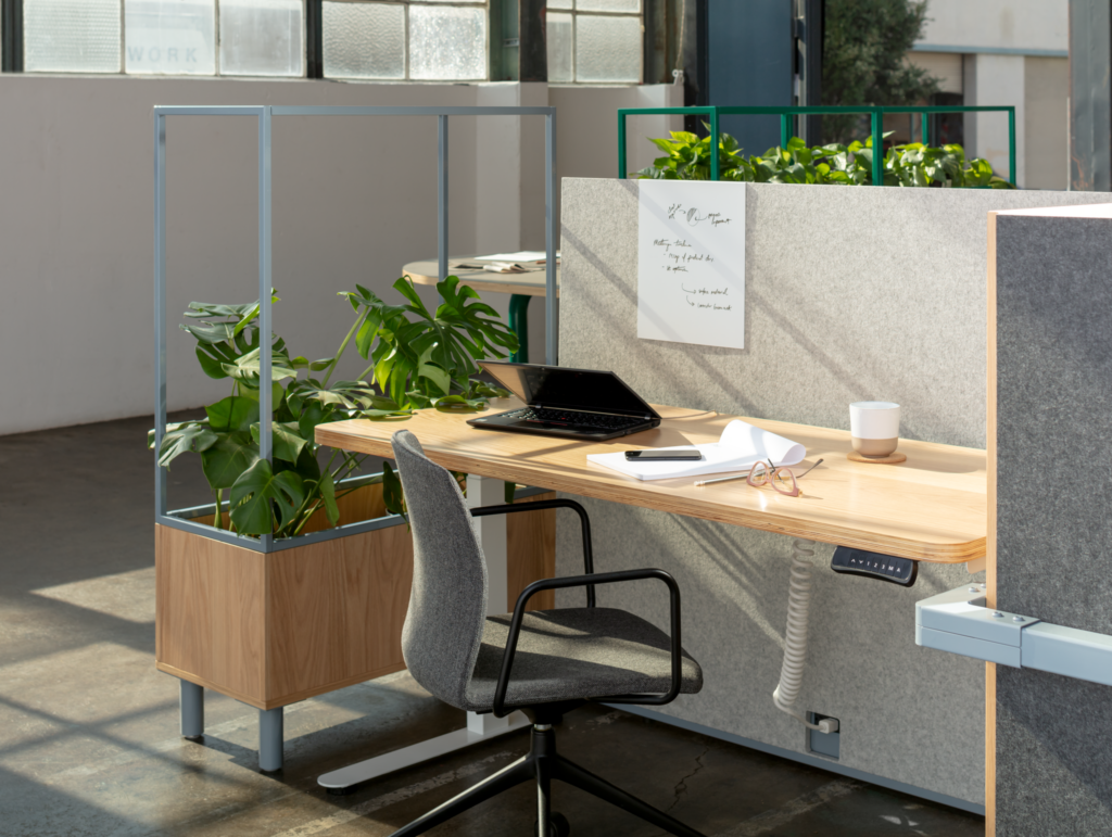
A sample workstation configuration with 90-degree beam connector visible on right.
There’s literal connection here, noticeably in the rectangular-profile modules that form the spine of the system (the Gradient “Beam,” in more specific parlance), but also a figurative species of it too, since the idea for Gradient emerged from thinking about connection in all its iterations: how workers flow between collaboration and privacy, how firms evolve different requirements and degrees of connection across time, and how cultural change and societal pressure forge the needs for different types of connection, and—especially in recent years—separation.
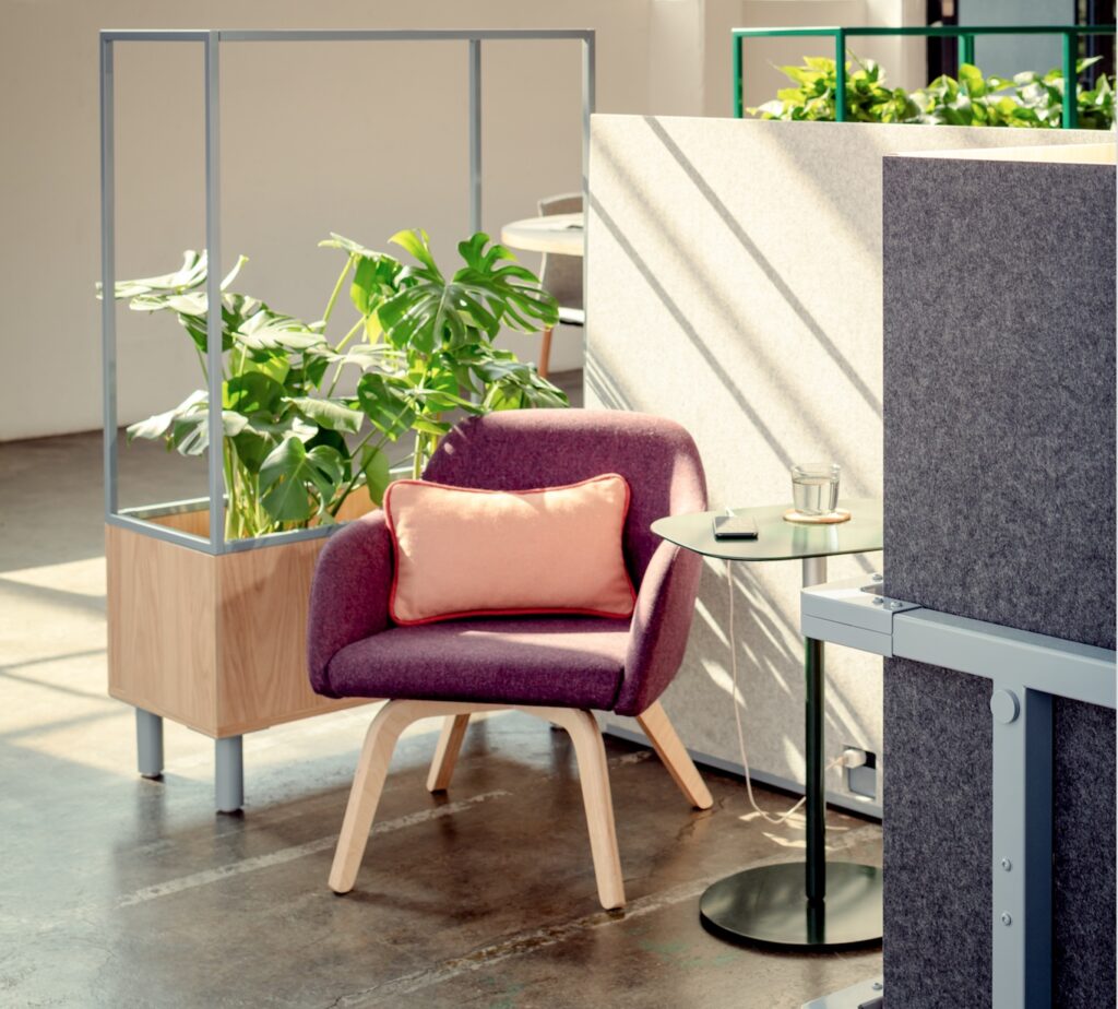
Gradient facilitates connection but also, when needed, privacy and separation.
The pandemic didn’t create Gradient. In fact, the principals of the project, Hillary Kalamaha, Elliot Whalen, and Brian Wilson (from Pair) and Kelly Dubisar and Louis Schump (from Gensler), cite a project that predates COVID as an important antecedent: the refurbishment of LinkedIn’s Omaha office.
Gensler Creative Director Schump says that this project was relevant to Gradient in that it crystalized some of the thinking about how work styles were evolving, “We were realizing that not only did one size not fit all, but that the current state would not be next week’s state… how do we —either in a sort of planning space or furnishing space—begin to anticipate that level of change?”
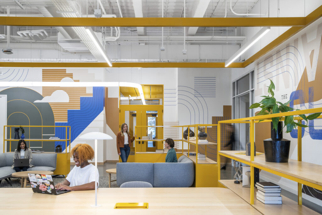
Anticipating change: LinkedIn Omaha is a dynamic space that supports a variety of working styles.
Of course, COVID didn’t invent work from home, but, as Gensler Design Director Dubisar remarks, “it elevated and pushed that notion forward, faster than it would have taken on its own.” The LinkedIn project was driven by a need to accommodate different working styles. Like Gradient, it featured a variety of sheltered and collaborative spaces, elements that reflect the move away from one worker/one desk: a structural beam with integrated power and cable management, a tailored ratio of dedicated workstations and collaborative desks, height-adjustable work surfaces, privacy screens, free-standing and end-cap storage modules, and breakout lounge areas.
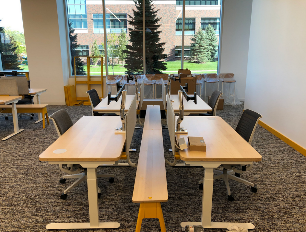
The power beam at LinkedIn Omaha. Functional infrastructure with an appealing and cohesive aesthetic.
The crucial difference between the two, according to Pair Founder Wilson, is that LinkedIn Omaha was essentially improvised: “We hacked it together, figured it out, and developed some custom pieces, but it wasn’t an entire system… the idea behind Gradient is a system that, in its entirety, would solve for everything that was going on within LinkedIn.” Dubisar seconds this: “The impetus was to make an ecosystem that could support a spectrum of work styles, from focus to hyper collaboration, all within the same kit of parts.”
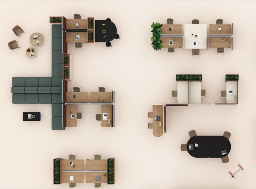
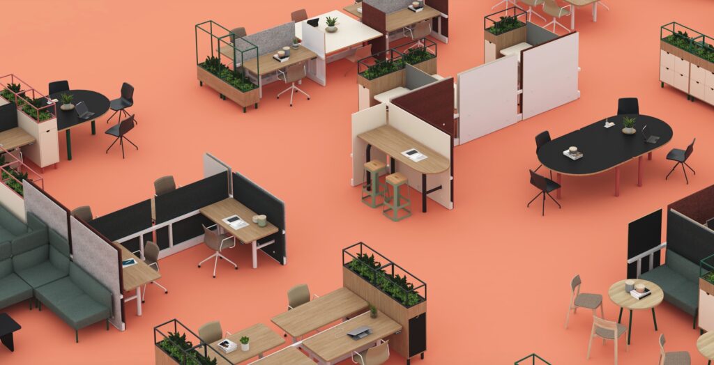
An overhead view of a sample Gradient configuration.
AAn
This is where Design Engineer Whalen chimes in, explaining that the most salient features (or those that make Gradient’s functionality readily intelligible) are 1. the fabric screens that can be added or removed easily by anyone, and 2. the two-legged work surfaces that cantilever off the structural beam.
The screens are an intuitive feature that operate with threaded screws featuring an attractive powder-coated detail: “You just unscrew them, remove the panel, and expose that frame beneath or swap it out for a white board, or for an acoustic material… desks and frame lengths can be conjoined or separated in the same intuitive way. The idea was to use the same screws everywhere on the system, standardizing the connections in order to minimize the amount of hardware and the number of touch points needed to reconfigure.”
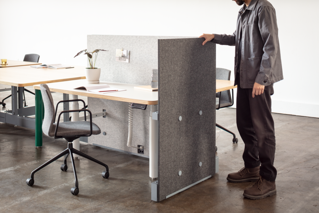
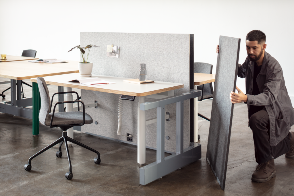
Changing the Gradient screen. The frame behind it offers an appealing aesthetic, even when exposed.
Note Whalen’s comment above about “exposing the frame,” which is something most systems furniture would likely eschew. Schump explains that this is a crucial difference between Gradient and other systems: “Typically, the kind of transformation we’re talking about is all buttoned up. Nothing shows. It’s all plastic, trim, and fabric panels.” With Gradient, the exposed framework doubles as a design feature. Kalamaha, who led and managed the Design and Application team, comments that “the frame can be fully cladded with screening elements or it could be completely stripped down depending on what type of aesthetic the end user or the client is after.” Schump concurs, “The frame is an aesthetic element that can be colored in such a way that it would support the branding of a major bank as easily as that of a major tech company.”
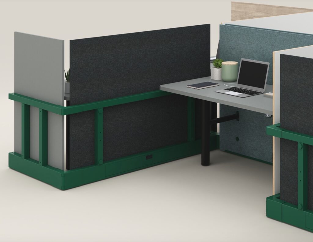
The Gradient Beam in bright green. The “spine” of the system, the Beam can be powder-coated for cohesive branding.
Gradient has not yet been actively deployed, but plans are in the works. This August, the Pair team will install Gradient in Gensler’s San Francisco office—presumably to replace or at least substantially supplement the current United Nations approach mentioned by Dubisar. And later this fall, they’ll unveil an installation in the Cal Arts animation department. Just like LinkedIn Omaha, this project has proven to be a learning experience, as the client has requested some custom add-ons and alterations, including wider screens, storage shelves with greater capacity, and a more permanent screen attachment mechanism (planners had voiced concerns about students running off with pieces of the system).
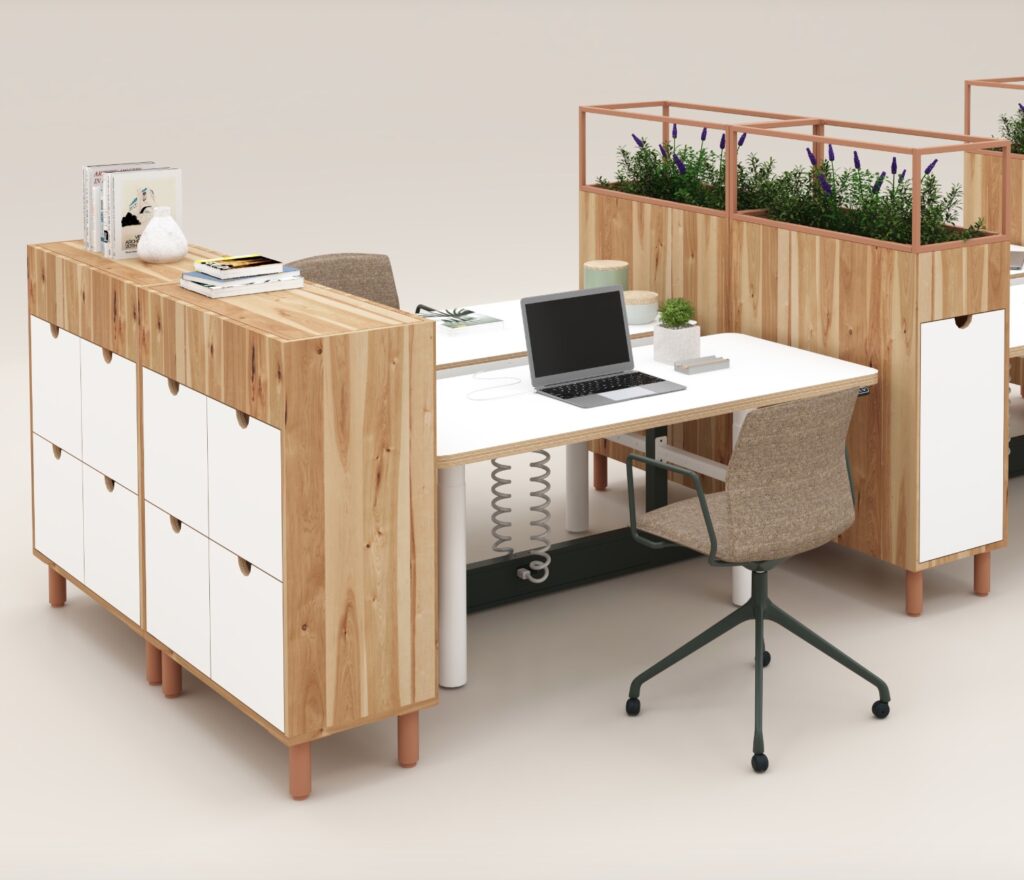
Here’s Gradient with a white beam book-ended by matching storage and a dedicated niche for greenery.
Wilson remarks that Gradient has this intuitive sense of evolution built into it, so he’s not surprised that the creative types at Cal Arts suggested these modifications. One thing it’s got going for it (or against it, depending on your perspective) is that it has this dynamic quality of untapped or unexplored potential. All five members of the Gradient team expressed their sense of it as a living system, a notion that was central to its genesis. They’re genuinely excited to see what can be done with it, what kinds of fanciful iterations users will devise that will pleasantly surprise even its creators.
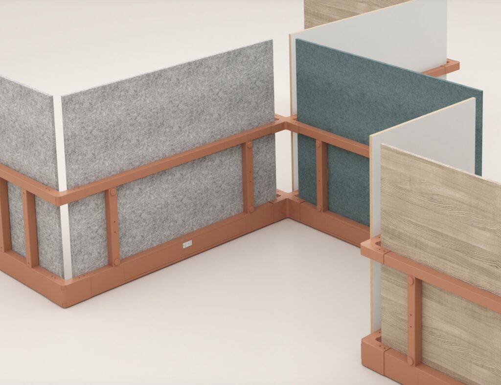
A sample Gradient set-up demonstrating the range of color and material options.
Playing devil’s advocate, I challenge Schump on this last aspect, voicing concern that, for decision-impaired people like myself, might it be overwhelming? Is there a risk that it’s alienating because it offers too many choices? Is it too imaginative? “Of course there’s a risk,” he replies, “when I grew up we had Tinker toys and Lincoln Logs and basic Legos, not Star Wars‘ or Princess Mononoke Legos. You just had to make the stuff up, right? Is that for everybody? No. Are Star Wars‘ Legos for everybody. No. Will you alienate someone by having a point of view? Of course. Is it our job to do the lowest common denominator? The approach that least offends?”
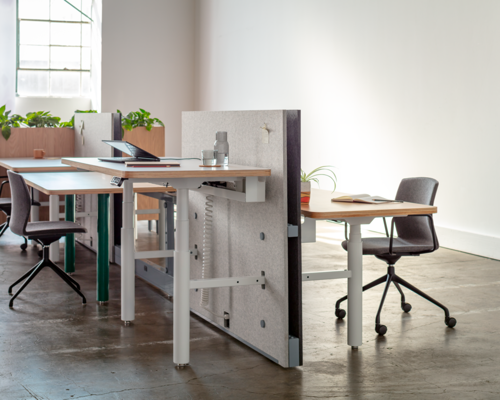
An intuitive approach to mixing work-surface heights. Also a good view of the way the desks cantilever off the beam.
Here’s another snippet from our conversation that encapsulates both the character of Gradient and the perspective of the Pair/Gensler team. I had remarked that, looking at the Gradient images, it’s challenging to conceive of it as a single, stand-alone product because it manifests in so many different iterations, not only in terms of the components and the ways they interact, but also in very different aesthetics. “It’s difficult to write about,” I say, “because it’s hard to get a handle on exactly what it does and how to describe it… the images look like they’re from totally different interiors.” “That’s great,” responds an enthused Schump, “So write about that…”
Gradient continues its evolution in the coming year. The Cal Arts project will likely be completed in late 2023 and Pair has projects in the planning stage for 2024. In the meantime, contact hello@madebypair.com.

Leave a Reply