
So Very Peri
Pantone has decreed that 2022 is the year of Peri.
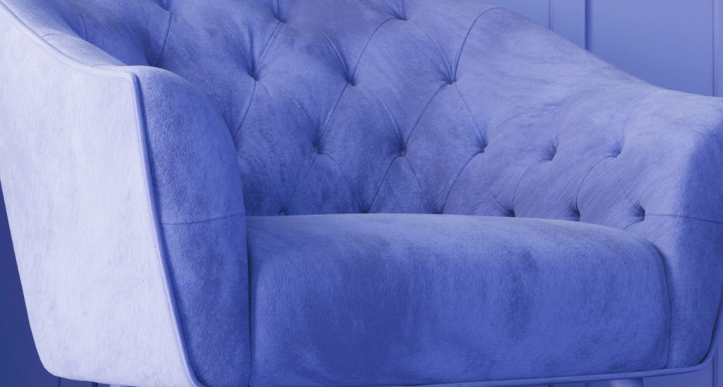
With Very Peri—marking the first time Pantone has created their color of the year, rather than drawing on existing stock—they seem to be going for a synergy of energy and calm. To wit, “encompassing the qualities of the blues yet at the same time with its violet-red undertone, Pantone 17-3938 Very Peri displays a spritely, joyous attitude and dynamic presence.”
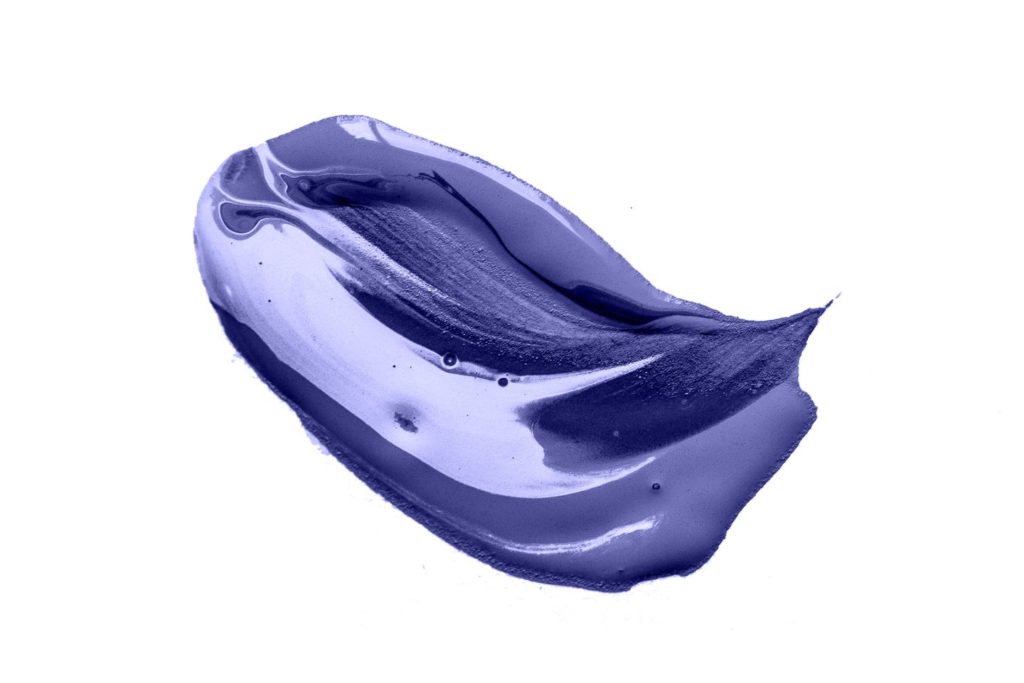
This dab of paint is definitely irresistible
Basic color theory tells us that the blues (especially the lighter-toned ones) confer calm, while the reds offer dynamism and energy. Pantone’s summation suggests that the blues help modulate the unbounded vim and vigor of the reds, like helping a caffeine-addled buddy to chill out and focus.
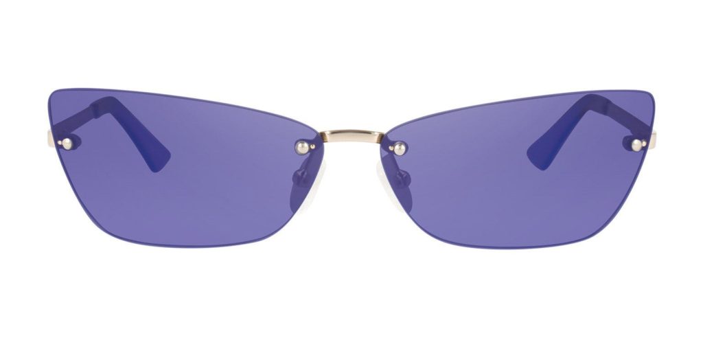
See the future more clearly through periwinkle-colored glasses
2022 needs focused energy, or, said differently, a synergy of enthusiasm, compassion, and hope. Perhaps by painting the walls of our collective subconscious with Very Peri we can help spread the word (and the mood).

A couple of observations:
- This is a feminine color. The erosion of gender norms notwithstanding, I think we all still have gut reactions to certain colors. To the cis-gendered males out there: have you ever owned a periwinkle garment? I may have had a t-shirt in the color back in the 90s. It was not my most flattering shade. And the press around Very Peri is woman-oriented. A search for “Very Peri” + “Man” returns a few high fashion shots with male models, but their appearance is notably non-binary. Not a lot of beards. No one splitting wood or hauling heavy machinery around in a 4×4.
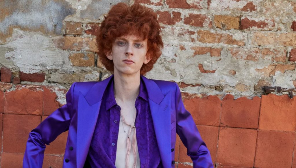
2. Anticipating Spring. Very Peri is a pastel, so can Easter be far behind? The choice operates under the supposition that we’re all craving emblems of hope, as if we could just bypass winter and reach for the blossoming buds of April and May. Perhaps this is accurate and perhaps it is not, but with Christmas looming, I feel a bit of a disconnect, even as the current semi-warm gusts outside my window reinforce my confusion about the climate.
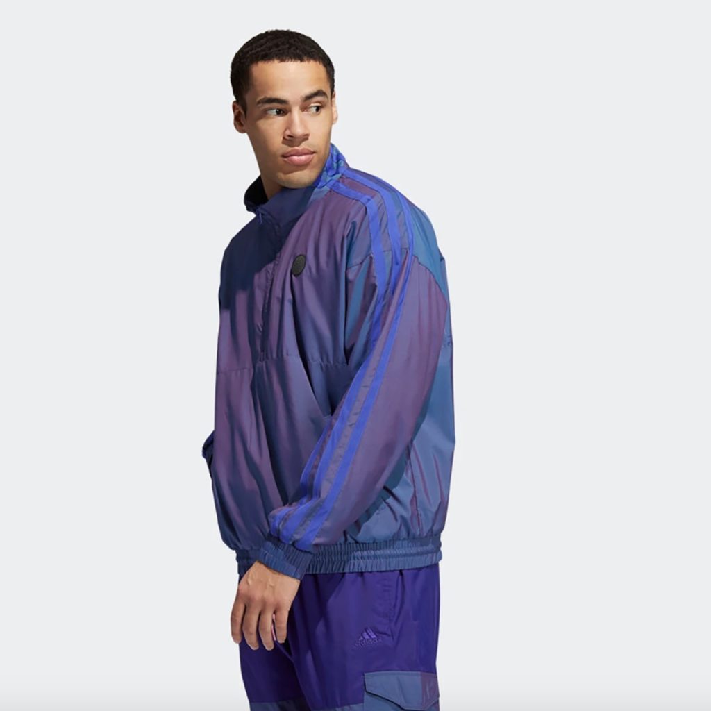
Dressed for Spring
3. It’s dreamy. This is both an intuitive reaction and a choreographed aim, especially prevalent in the Pantone promos. Periwinkle has a pacifying intent. It’s slightly soporific. It promotes a kind of mental dissipation. It coalesces and dissolves. It is decidedly non-combative. In Pantone’s formulation, Very Peri tames the id of the reds, harnessing primal emotions for the greater good.

I’m excited about Very Peri. It’s a beautiful color that’s hard to critique. It evokes both nature—violet-tinged sunsets and creeping Vinca vines are two quick examples—and the allure of virtual reality (Pantone has said that some of their research involved identifying prevailing color schemes in gaming communities). This suggests that it’s both old and new, perhaps the perfect formulation for a winning trend.
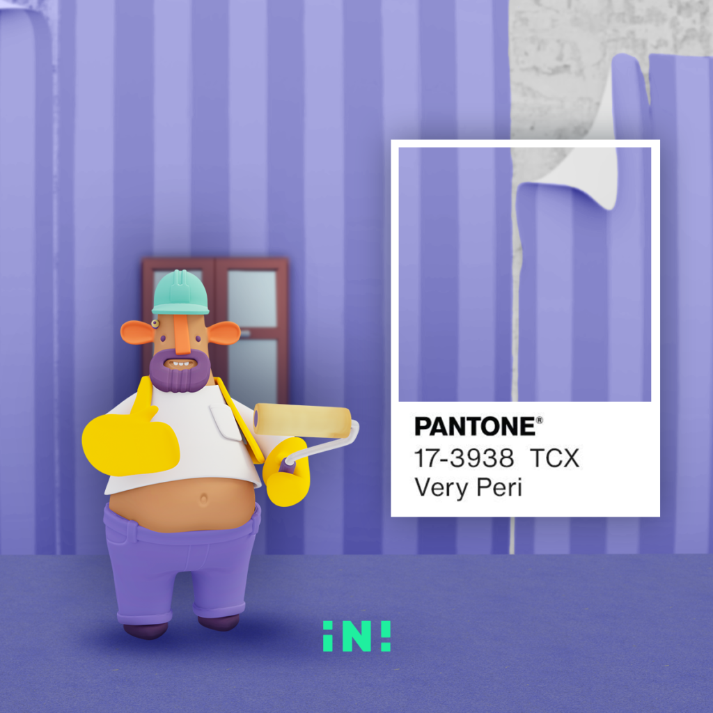
Very Peri: the color of your virtual reality
And while early iterations seems to involve high fashion and various ways to adorn your own person, I look forward to Very Peri trickling down into product and home décor. In spite of its feminine bent, Very Peri is a fairly inclusive color, one that’s hard to get mad at—which is sorely needed in these divisive times.


Leave a Reply