Ka-Lai Chan’s SheLLf at Galerie Judy Straten
Ka-Lai Chan’s SheLLf is a festival of contrasts. First, there’s the interplay between the smooth lacquered exterior and the rough cut interior; next, the stark contrast between the light tint of the inside and the dark-as-night-shade of the outside; finally, there’s the triangular trickery of the shelves’ structure, creating the varied dimensions that wreak havoc with our expectations, as a traditionally flat surface becomes strangely angular and irregular. This—coupled with the way the dark surface manipulates shadow and light—tricks us into seeing our typically flat walls as intriguingly angled.
SheLLf. Designed by Ka-Lai Chan.
Motion Dramatized in Emerging Storage
The perspectival inversions of SheLLf only begin to scratch the surface of Ka-Lai Chan’s intention. As the designer explains it, the agglomeration of different boxes (some with five sides and some with four) creates a sense of motion, like the individual stills in a film reel: “SheLLf goes from flat to more depth and spatiality, from small to larger and from one to several, various cabinets crawling in an exiting motion over the wall.. almost literally growing out of the wall to crawl out of their shell and take place in the surroundings.”
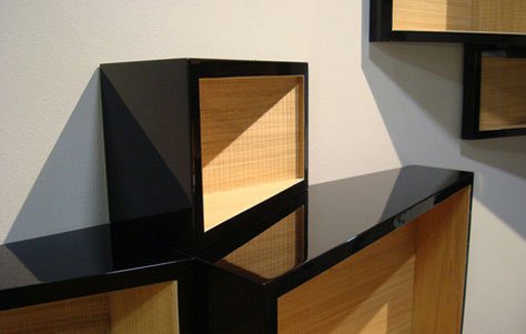
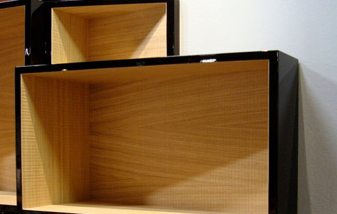
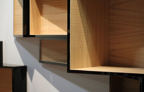
SheLLf thus projects a dynamism that’s unusual in a storage system (though not unprecedented—see Reef by Neuland). As such, the piece reflects the designer’s emotional investment in her work. Ka-Lai Chan says that SheLLf refers to her own tendency toward introversion, to her struggle to “crawl out of her shell and meet the expectations of the world around her.” This insight explains the piece’s name, as SheLLf is both shell and shelf. This particularly unusual and innovative wall unit will bring all comers out of their respective shells, as any wares that adorn its unfinished insides are en pleine air— highlighted by the beautiful glossy black, unbounded by the confines of doors, and proudly on display for all the world to see.
Via MocoLoco.
Leave a Reply