Bo Reudler’s Amsterdam Bathroom is Nouveau Antique
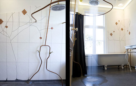
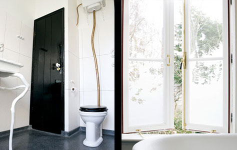
A mere glance at designer Bo Reudler's website is sufficient to foment anticipation of some serious nouveau antique. That may seem like a contradiction in terms, but how else to characterize Reudler's landing page-a charcoal folio in leather with embossed designs at the corners and Reudler's name in raised and gilded letters followed by the enigmatic signifier, "Opera Selecta." The components of this particular composer's Opera include signature product-featuring an aesthetic somewhere between Tim Burton and Salvador DalÃ-and complete interiors, like his recently completed Amsterdam bathroom. Boasting a materials palette of plaster, terrazo, brass, copper, glass, and porcelain, the space takes its cue from the sole surviving elements of the 100+ year old residence: the cast iron clawfoot tub and timber doors.
Amsterdam Bathroom. Designed by Bo Reudler.
Embracing the Historical in Millennial Amsterdam
Reudler says the client brief requested a "contemporary design that would complement with the historical character of the house." To that end, the designer synthesized the sometimes contradictory elements of nature and history in an effort to eschew the familiar ultra-modern look of many bathrooms: "the aim was to take away the sterile character associated with most modern bathrooms to create a space that literally came alive." So wherefore the life in Reudler's Amsterdam bathroom? in the stucco patterns on the ceiling-made to resemble the concentric patterns of descending water droplets; in the exposed and intriguingly contorted copper piping; in the sandblasted glass of the tall casement windows, that duplicate the look of ice crystals on glass; in the cleverly "cracked" tiles adjacent to the bath, that imply the patina of age, yet in fact form the stems of a very 21st century floral relief.


Each of these separate elements achieves the nifty trick of a subdued functionality: the sandblasted glass provides privacy; the exposed pipes take a page from the Bauhaus to do away with fancy fittings; the etched ceiling matches the "Narcisse" Mirror-made of varying thicknesses of glass-to create an aesthetic continuity that implies the crooks and quirks of antiquity. Such is the gist of this unusual yet alluring bathroom, inspired by the organicism of age, the ebb and flow of nature-with nary a stainless steel mixer in sight: "experiences of nature formed the inspiration: the characteristics of water, the interaction of light and shadows, frost and decay, taking into account the ageing of the space and the materials."
Via FrameMag.


Leave a Reply