A Piece of LA: Slab by Neo-Metro
Since I’m on my way to Los Angeles this week to visit my brother, my thoughts are on west-coast companies like Neo-Metro. With its headquarters located a mere twenty minutes from LA, Neo-Metro is most definitely a California entity—although if you’re looking for their showroom, you will only find it virtually (not that there’s anything wrong with that). Thanks to their principal Kristin Kahle, you can get all the product information and photographs you need at their website showroom; unlike other K+B firms, Neo-Metro’s internet location gives you precise, detailed, valuable information (and no jazzy flash or ambient orchestration, for which I am extremely grateful).
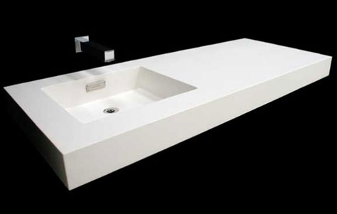
Slab. Designed by Neo-Metro.
Simple, Sleek Sink
New last April, Slab is a departure from Neo-Metro’s previous work, which is characterized by “custom hues, Pantone®-matched powdercoats and high-gloss or satin finishes” (see Ebb Concept, for example). Simple, minimalist, and white, Slab “is a monolith” with no embellishments or visible supports. The “smooth, solid surface” accommodates one or two basins positioned at center, left, or right. You have your choice of sizes as well: Slab is available in 36”, 42”, and 55” configurations, all of which are 22” deep and 4” thick. The simplicity of Slab—and its name obviously reflects this—is obvious. There’s no ornamentation hiding anywhere. Slab is refreshingly honest in this regard. While Neo-Metro’s other sinks exemplify the flash and color of the famed west-coast metropolis, Slab is restrained. It’s the K+B equivalent of those unknown LA neighborhoods that hide here and there in plain sight (Culver City’s eastern edge comes to mind, where architect Eric Owen Moss has slowly transformed Hayden tract).


Leave a Reply