Magnus Olesen’s i-SIT
It seems everyone wants to ride Steve Jobs’ coat-tails. In an era when the diminutive lower case “i” has become a bellwether for technological innovation, competence, high functionality, and sleek design, an association with Apple makes for excellent PR. We’ve already seen this subtle linkage with products like Ross Lovegrove’s 100% Desk Lamp, the Blue Lounge Studio Desk, and Ki’s eCoupled Wireless Technology. Each of these present an auspicious synergy, but Magnus Olesen’s i-SIT Lounge Chair is the first product I’ve seen that actually resembles a classic i-Mac.
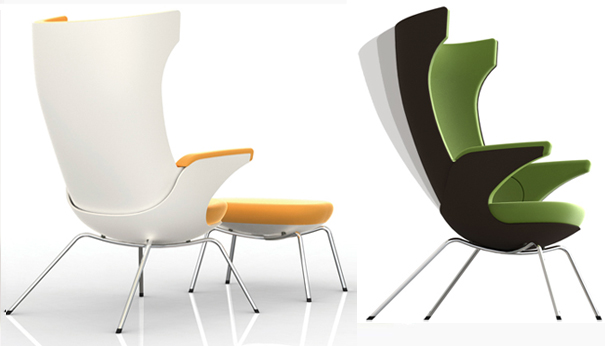
i-SIT. Designed by Magnus Olesen.
The gentle curves of Olesen’s handsome, ergonomic chair are loosely modeled after the clean organicism of i-Mac’s casing, but the resemblance is definitely more than skin deep. Olesen’s objective with i-SIT was to create a back-friendly lounger that resembled neither a task chair nor some industrial number you might find in an orthopedist’s office. To that end, the Danish designer concocted a shell of laminated birch, a vibrant upholstery of summer wool, and a quartet of tubular steel legs finished in shiny chrome. The high-backed silhouette and contrasting upholstery give i-SIT a compelling aesthetic aligning it with signature pieces like Jaime Hayon’s LOUNGER and Javier Mariscal’s Muebles Amorosos, but those designers hail from sunny Spain, and i-SIT’s compact functionality is distinctively Danish.
Since Olesen’s objective with i-SIT is the easy integration between ergonomics and appearance, the chair contains a number of skillfully integrated features–none of which it wears on its Scandinavian sleeves, if you will. These include a high back support, a lumber pillow, and an adjustable inclination. The latter pairs the chair with the natural rotation of the user’s hip, which means that–much in the manner of Apple’s enhanced capacity to sync technologies for optimum functionality–i-SIT anticipates your every move. So no matter what contorted extremes you may twist yourself into, i-SIT helps your spine stay aligned. And it looks darn good doing it too.
Via InteriorDesign.


Leave a Reply