Rek
As you might have guessed from so many of my other posts, I can’t get enough of Dutch designers. Another thing I love to cover is bookshelves: see Matching Tree and Cave Pet’s for starters. [via Dezeen]
Rek. Designed by Reinier de Jong.
So it is with great pleasure that I bring you Rek, a zigzag-shaped bookshelf designed by Rotterdam-based Reinier de Jong. Not only does Rek bring together two of my obsessions-the Dutch and books-but also it does so with excellent practicality and playfulness. And I love anything that disguises the functional in a festive package. Which is one of the reasons I love books: they look so serious and staid and yet they contain wild rantings and vivid landscapes and existential quandaries and all manner of insubstantial substantiations. Yes, I love a paradox.
De Jong’s Rek embodies such an enigma. A five-part bookcase that slides open to accommodate a growing collection of reading matter, Rek “will always be full.” It can never contain nothing, for when it contains nothing, it contains itself-artfully arranged as a geometrical sculpture. When closed, it reminds me of a topiary maze. Yet, Rek is absurdly utilitarian: de Jong explains that “with the different spaces that appear you can arrange your books according to their size.” No more moving shelves up and down to make room for those peskily tall art tomes-Rek has a spot for all trim sizes.
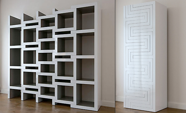
Finished in a white high gloss laminate on the outside and a dark grey satin on the inside, Rek sets off books in a way that cannot be matched by the standard fare bookshelves. In this way, Rek is a book-lover’s dream: it makes your books look all the better through its juxtaposition of texture and sheen. While Rek is a beautiful design all on its own, it is also meant to showcase its contents-a lovely stage for a lovely stage play world. Available through Bom Interieurs, de Jong’s Rek is perfect for all libraries-the large, the small, those in flux, and even the imaginary.



Leave a Reply