Splinter Table
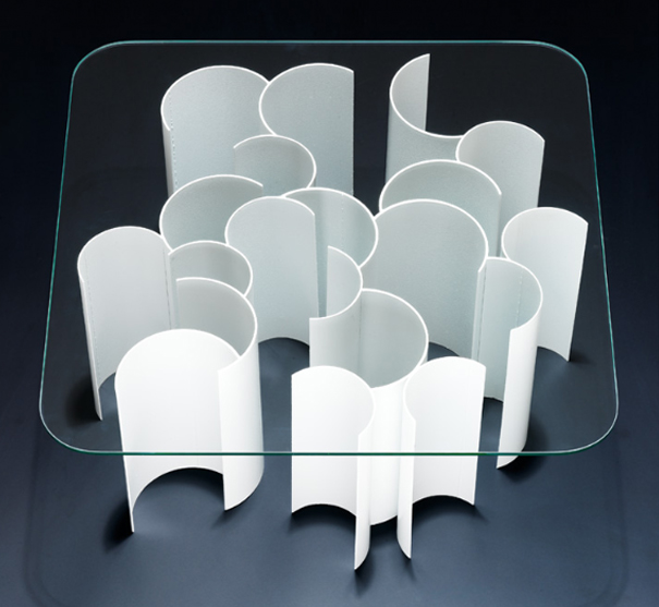
Designers are constantly facing the Herculean challenge of transforming utility articles into Object d'Art or more importantly reinvention. Hence it's always stimulating to view obligatory furniture in all its myriad manifestations and how through such exercises, designers seek to break into the thriving A&D scene. With the Splinter Table, freelance designer and interior architect Mia Cullin not only bids adieu to symmetry, but also strikes a balance between the delicate dichotomy of discordance and synchronization.
Splinter Table. Designed by Mia Cullin.
According to Cullin, the Splinter Table can be used as a sofa table or a side table and is available in two sizes. The frame comprises metal pieces welded together randomly with a glass tabletop. The designer may be dealing with something as prosaic as glass and metal, however she has managed to animate the Splinter by breathing in an avant-garde sensibility to it.

There is a method to Cullin's design madness. The metal pieces may be placed arbitrarily, yet the upshot is far from cacophonous. In fact the table almost has an incandescent quality to it, which may partly be due to how the metal pieces resemble small crescent moons. The table doesn't conform to conventional design bastions and moreover reveals Mia Cullins unstinting penchant for geometry and surfaces with relief patterns.
The irregular pattern of the Splinter makes me conjecture if sticking to tremendously straight lines is pass© and a thing of the past? Combining geometrical elements with contemporary aesthetics is quite fool-proof and while the Splinter Table doesn't make an extremely radical design departure it does slant towards a certain idiosyncrasy.


Leave a Reply