Do Chair
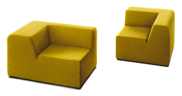
A dynamic duo from Zurich, J©rôme Gessaga and Christof Hindermann teamed up to launch Designrichtung in 2000 (now known as “Designheiten“) “with the aim of jointly developing and implementing interior design, exhibition design, product and graphic design projects.” Former Cabinet-Maker Gessaga and Businessman Hindermann both believe in imbuing their creations with a profound sense of the joy of design: "we want youthful curiosity to reclaim a place in our everyday lives through simple and day-to-day phenomena.” The gesture toward an innocent curiosity into the look and nature of things is certainly prevalent in the Do Chair, which in some ways looks as if it emerged from the mind of a child. The principal innovation of this piece is its dual-function dimensionality, which allows it to serve as either a chair or a mini divan/lounger: situate yourself the long way, and your back rests against a subtle slope while your thighs rest on the supporting cushion-a position conducive to assorted modes of lounging; situate yourself the short way, and you find yourself supported by the right angle between cushion and backrest-a position conducive to anatomically correct sitting.
Do Chair. Designed by J©rôme Gessaga and Christof Hindermann. Manufactured by Designheiten.

The chair’s aesthetic celebrates an overt geometricity. It reminds me of the ruthelssly shaped hedges in certain English gardens or of the outdoor mise-en-scene of two divergent late 70s/early 80s gems:The Shining and Being There. It looks like a sculpture in foam-I’m reminded of the sage’s take on sculpture as a science of removal, of finding the hidden form within the block of marble or the hunk of stone. In this case, though, the strategy seems to have been updated, and the tool of excision is not the chisel but rather the scalpel, the computerized lance, the laser-guided razor-as if the designer took a hot knife and carved the shape in the foam like the proverbial hot blade through butter. Gessaga and Hindermann use this shape and versatility to great effect, employing it to lend a playful irony to design and spatial arrangement, a concept to which both are committed. One option is to position several of the chairs proximally in a way that establishes linkage through a visual kind of “puzzle-piecing,” rather than through a traditional arrangement (which would position the chair’s users frontally in respect to one another). This kind of connection allows for a visual linkage which both embraces and refutes the compulsion for a harmonious and functional spatial arrangment. Of course, the Do Chair’s versatility let’s you have it both ways. If this doesn’t say “irony” I don’t know what does.


Leave a Reply