Barca
One of the great joys - and one of the more formidable challenges - of product reviewing here at 3rings involves student work. Though it’s always a thrill to see an intriguing new design by a burgeoning artist, it’s also unusual for said product to present with any useful information. Most often, breakout work by students that has been featured at a particular exhibit or otherwise caught the collective eye of the design community comes only with the barest of identifiers.
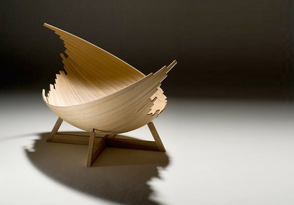
Barca. Designed by Jakob Joergensen.
This has been the case with with some of the student work we’ve featured during the past year: Marcel Sigel’s and Alana Di Giacomo’s Winter (winners of the Sydney Morning Herald Young Designer’s Competition); Pablo Crespo, Martin Franzen, and Isaac Pineiro’s Mr. Hyde Sofa (which turned heads at the Salone di Mobile), and the Egyptian-themed seating collection of 11 students of Yale’s School of Architecture (chosen as one of only four Design Schools to exhibit at ICFF). Here’s another one to throw into the mix: Jakob Joergensen’s Barca, one of just two winners of the coveted “Gold Leaf” distinction at this years International Furniture Design Awards in Asahikawa, Japan.

So with a bit of research, I was able to determine that Mr. Joergensen was born in 1977 and that he’s a student at Copenhagen’s Designskole. That, and the caption to Barca (Ash, Steel, W 1,200xD800xH250) were all I had to go on. Lucky for me that Asahikawa’s judges had a comment or two: “It is fascinating to see how much the sphere can be changed just by sliding these identical plywood boards that are used in boat making. This is a very innovative work”; “It’s surprising to see a work with such a totally new idea. From the right angle, this piece has a fascinating shape that reminds me of a Viking ship”; “This work is not quite mature yet, but that is one of its charms. I’m excited about its creative potential.”
Lest I leave it up to these three Japanese gentlemen to do all my work for me … the consensus seems to be that Barca (if you hadn’t picked up on it by now, the name is Spanish for “ship”) represents a new direction in design, one that suggests unusual shapes applied in innovative ways, but yet has an “unfinished” quality about it. A notion to which I’d reply, “that’s exactly the point.” Barca is captivating precisely because it’s unfinished, an overtly expressed quality aligning it with other products suggestive of process or progress halted/interrupted or fortuitous arrangement through happy accident. And I’m not just referring to Return of the Jedi‘s semi-constructed death star - which, to my 12 year old’s eyes, looked more blown apart than half-built - but to contemporary stars like Robert Stadler’s Rest In Peace, or Maarten De Ceulaer's Pile of Suitcases. These are all projects that play with our notions of “design” or “construction,” suggesting in the process that sometimes it’s about re-creating the look of the unfinished, or destroyed, or haphazard. As to the question of the functionality of Joergensen’s piece (one blogger has commented, “very inspiring … even so, I still don't know what it is.. a chair? a bed?”), I’ll only say that time (and marketing) will answer such questions. As for me, were it within my physical purview, I’d make due with a fetal position and a couple of choice pillows.


Leave a Reply