
Too Hip for Pepsi
Who says commercialism can’t be cool.
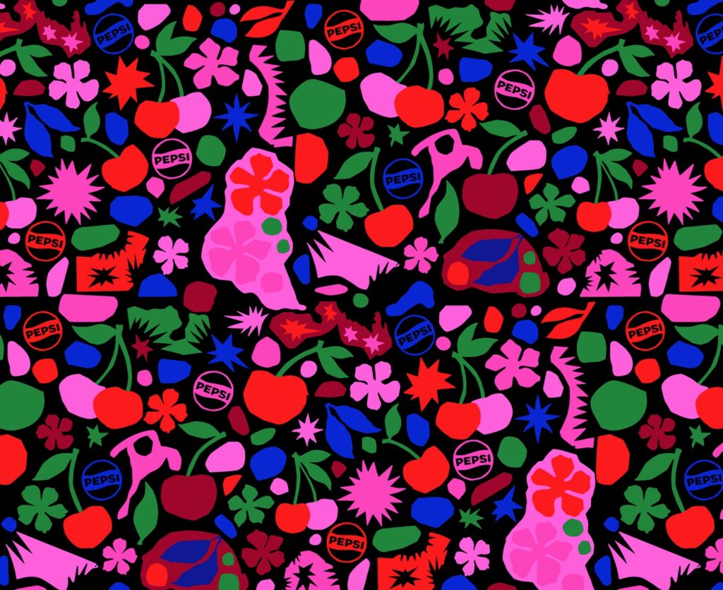
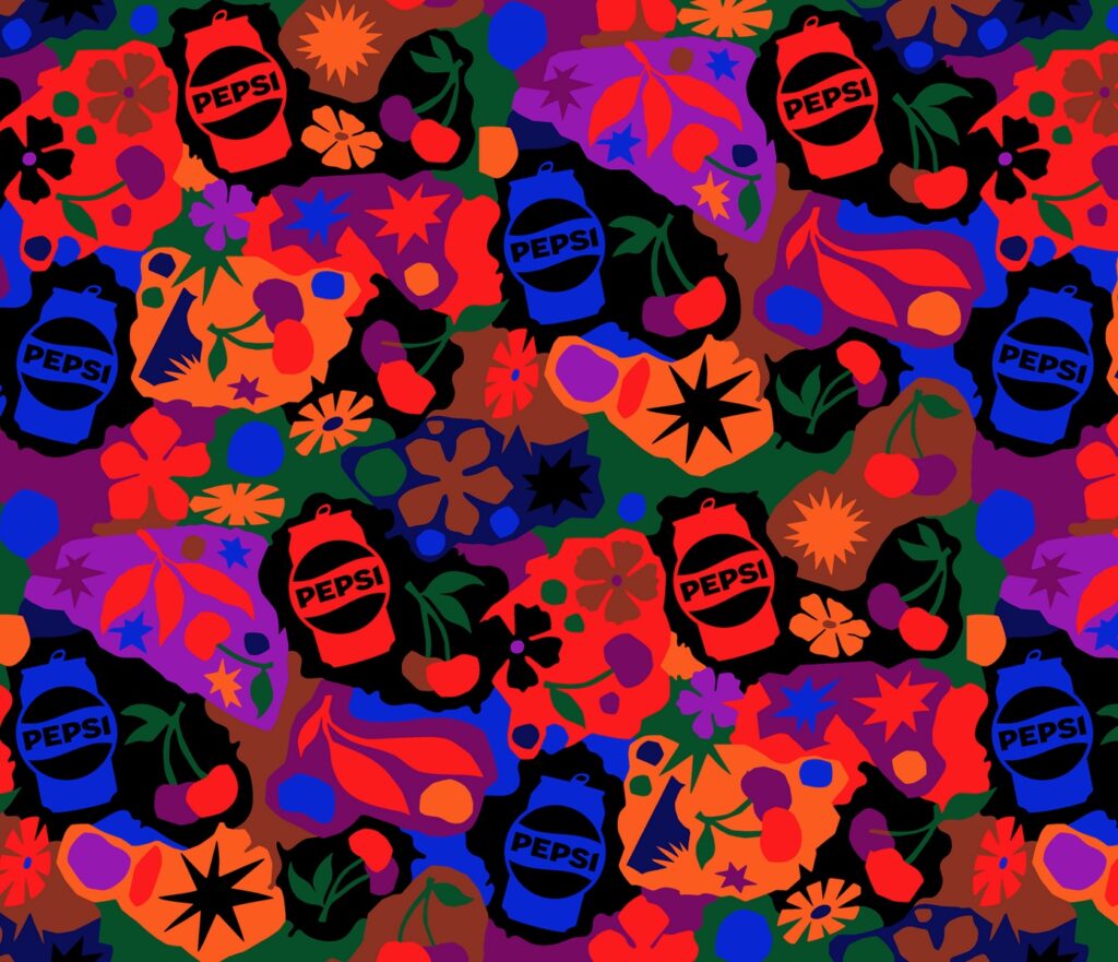
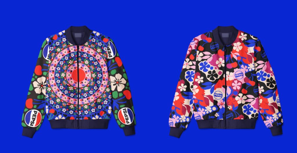
These endlessly creative iterations from Nick Liefhebber and Closer and Closer Artists exist because the company requested a set of branding illustrations for their Wild Cherry campaign.
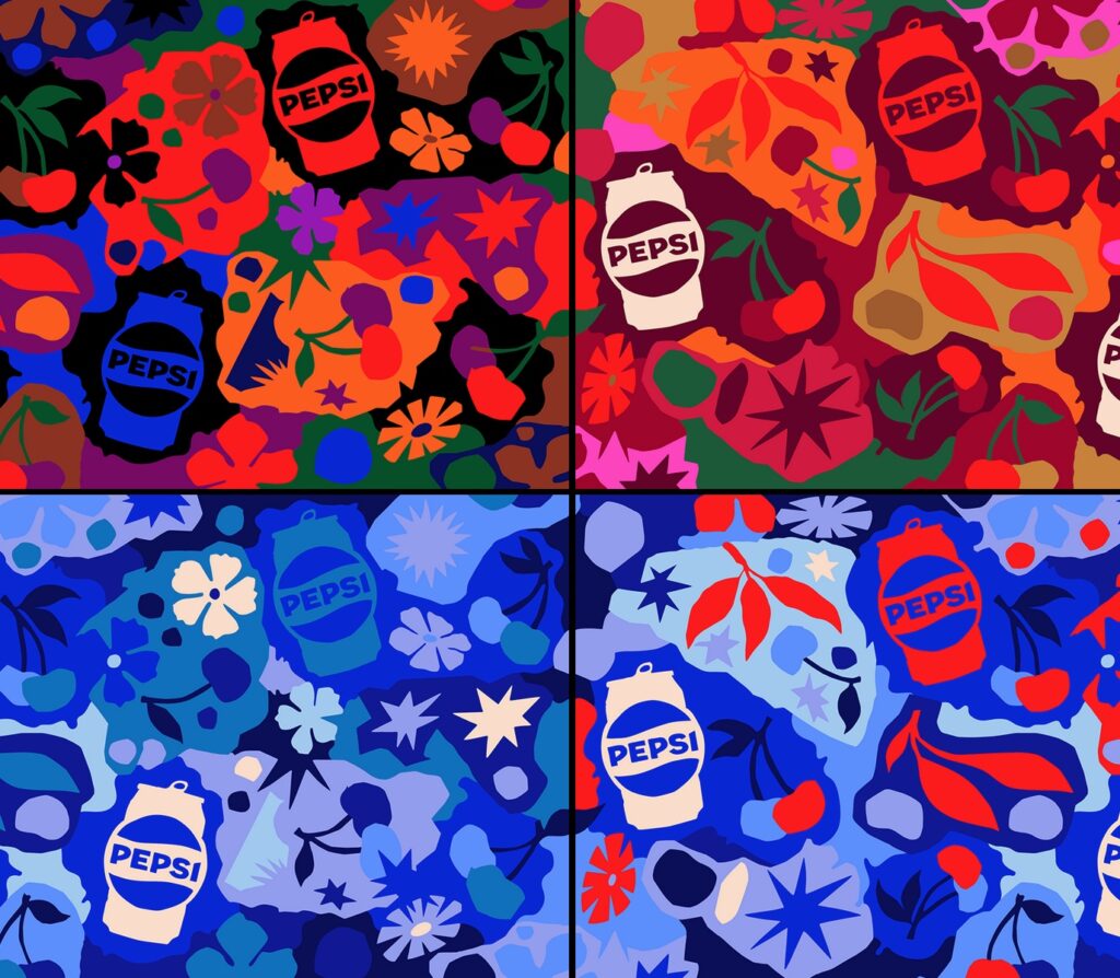
We especially dig the Warhol-esque version below.
No word yet on whether they won the job, but they certainly get our vote.
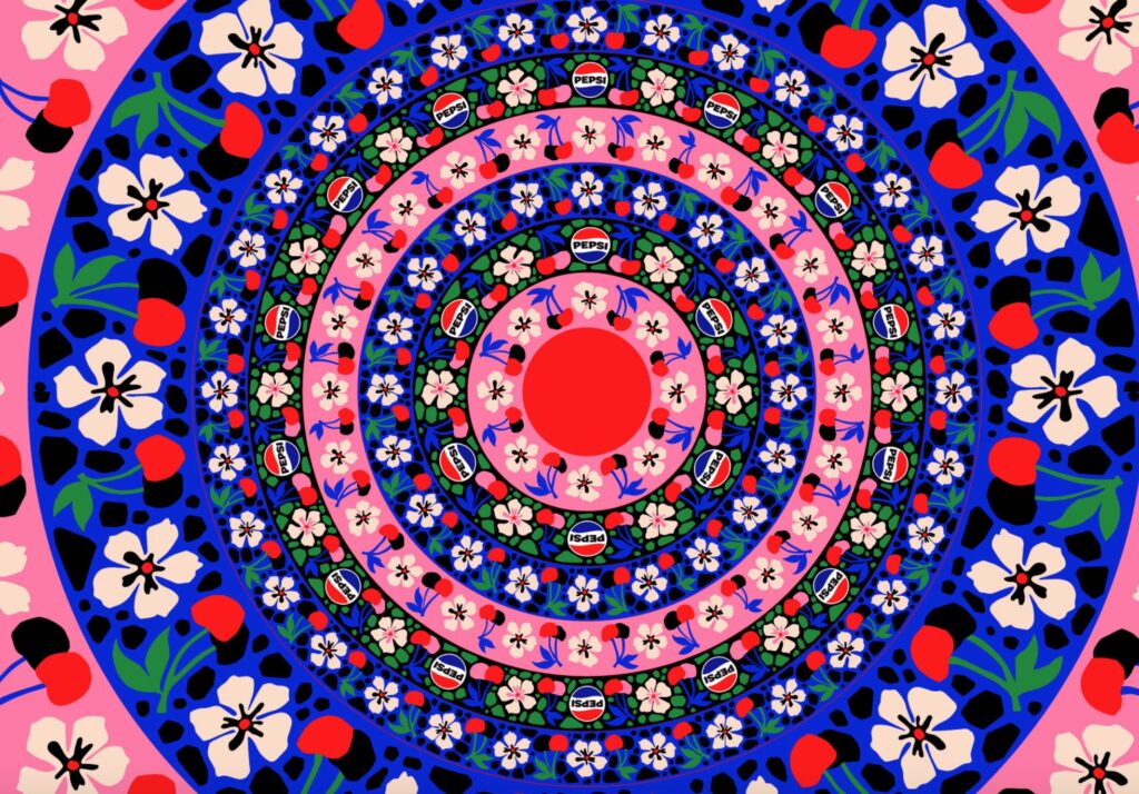
Here it is on clothing. Furniture upholstery would be even better!
See here to find out more.
Related Posts


Popular Videos

Leave a Reply