Will MacCormac’s Follo Sink
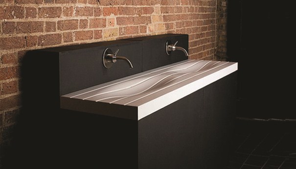
This week’s sinks have something in common. Both the Erosion Sink and the Follo Sink use sinuous lines to create depth and movement. I think it’s always good when bathroom fixtures rebel against their staid history. In the past, these poor creatures have had to endure entombment in porcelain—rigid, unmovable, and fixed. But today designers are trying to change this trend, having sinks (and bathtubs too) echo the water they are meant to manage. Wave-like forms indent the Follo Sink, creating a deep center bowl that is subtle and surprising.
Follo Sink. Designed by Will MacCormac.
The obliteration of the edge here mimics the natural ebb and flow of beach waters. And while some have questioned the functionality of Follo, its organic shape seems, at least to me, to cup the water and navigate its surge and drainage. Simply because a vessel looks impractical doesn’t mean it is—looks can be deceiving, after all, even in design. Anyone who’s ever sat in a chair that looks uncomfortable and found it comfortable will second this opinion (or, sadly, anyone who’s ever sat in a chair that looks comfortable only to find it painful).


Designer Will MacCormac thought up Follo after a disastrous visit to Niagara Falls where a sudden attack of aqua phobia rendered him transfixed by the rushing streams—not really (for that story, see the Ring Faucet). In actuality, MacCormac has been rather silent since the Follo Sink’s 2007 release. His website promises to be updated soon, and we should all hope so. In the meantime, everyone needs to be satisfied with the mysteries of Follo and MacCormac. Like the oceans, both cannot be adequately grasped, elusive as the rolling waves that inspired the sink’s grooves.


Leave a Reply