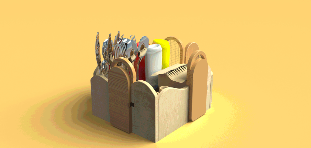
Twisted Arches by Wrishita Vaish
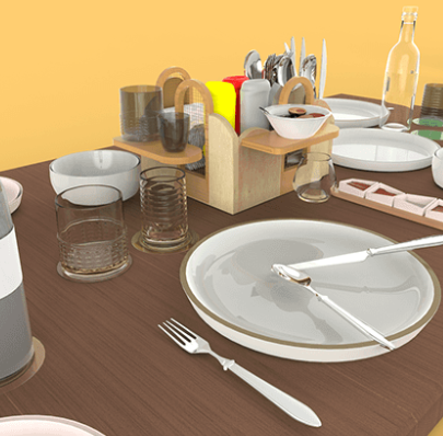
The process of solving a spatial problem often involves analyses and graphics to arrive at a reasonable solution. With Twisted Arches, design student Wrishita Vaish wishes to solve the problem many restaurants encounter: keeping condiments and utensils at tables, while still leaving enough space for diners to feel comfortable with their individual comestibles.
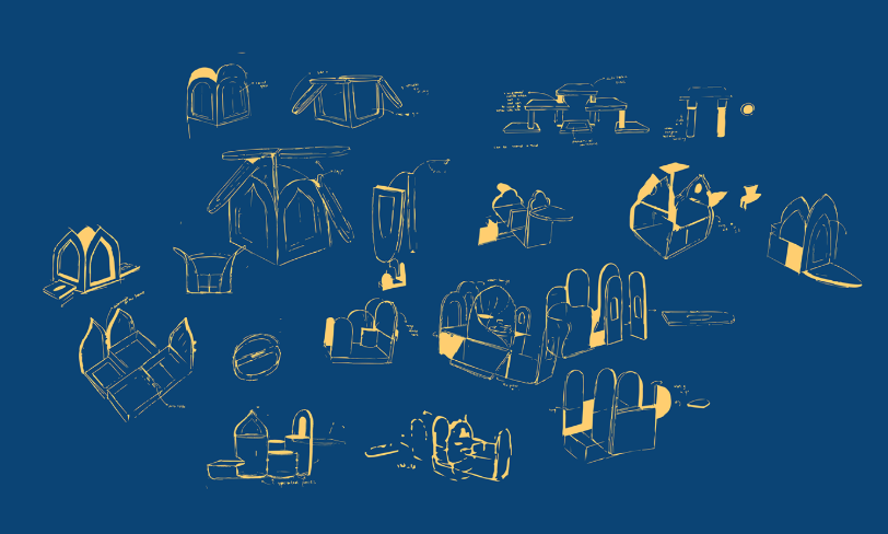
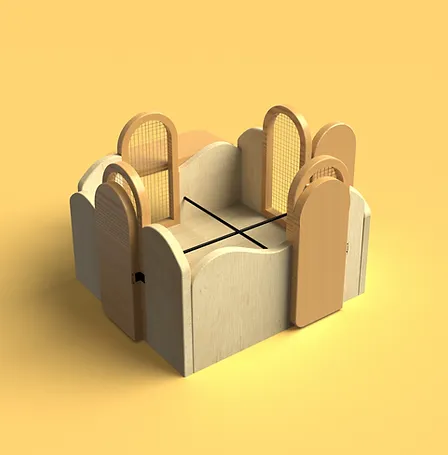
Vaish’s solution reminds me of the paintings of Giorgio de Chirico (1888 – 1978), who combined classical architectural elements with the imagery of Cubism, which flattened spatial structures and reduced shapes to simple planes. He also combined disparate elements into a coherent whole.

Here, Vaish has recreated the architectural elements of overlapping arches, the outer ones also functioning as small shelves. Two different but similar elements combined in a utilitarian fashion contain items on tables, while leaving enough room for dishes from the menu.
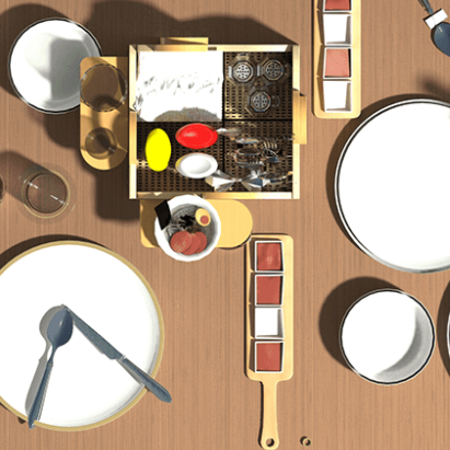
See more of her work at her portfolio. For another clever storage solution, check out Binny.


Leave a Reply