
Woven Gradience by Interface: A New Look for Carpet Tiles
If you’ve been pining for a floor scheme that subtly transitions from one color to another then look no further.
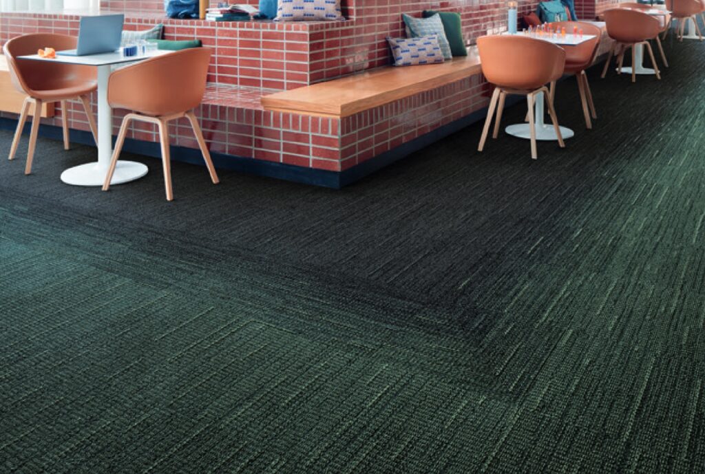
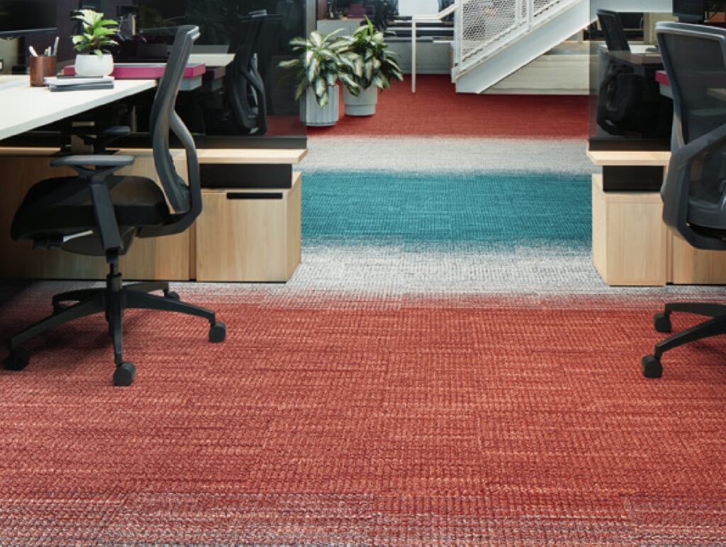
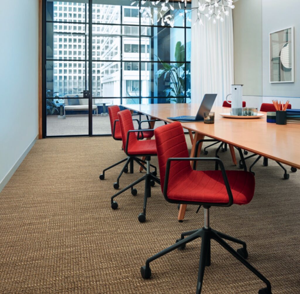
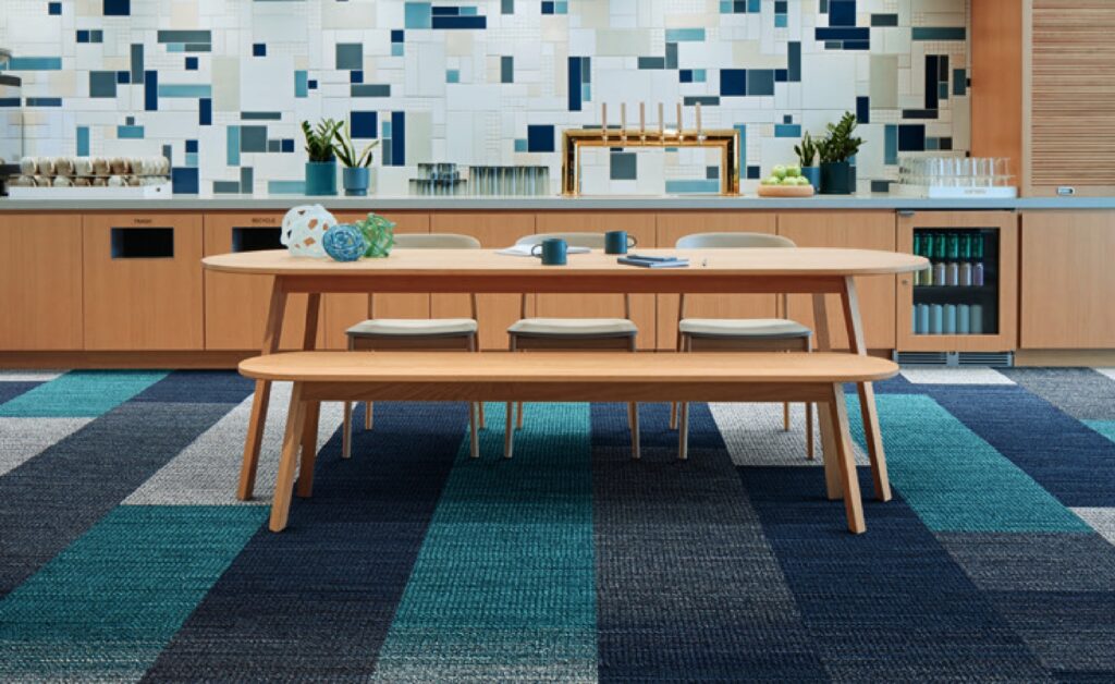
Interface’s Woven Gradience collection is comprised of two styles of carpet tiles that manifest in hundreds of different designs. It’s a simple but ingenious concept: WG100 is a solid neutral offered in 14 colors, while WG200 features 18 unique color palettes, each with a distinct gradient to transition from one color to the next.
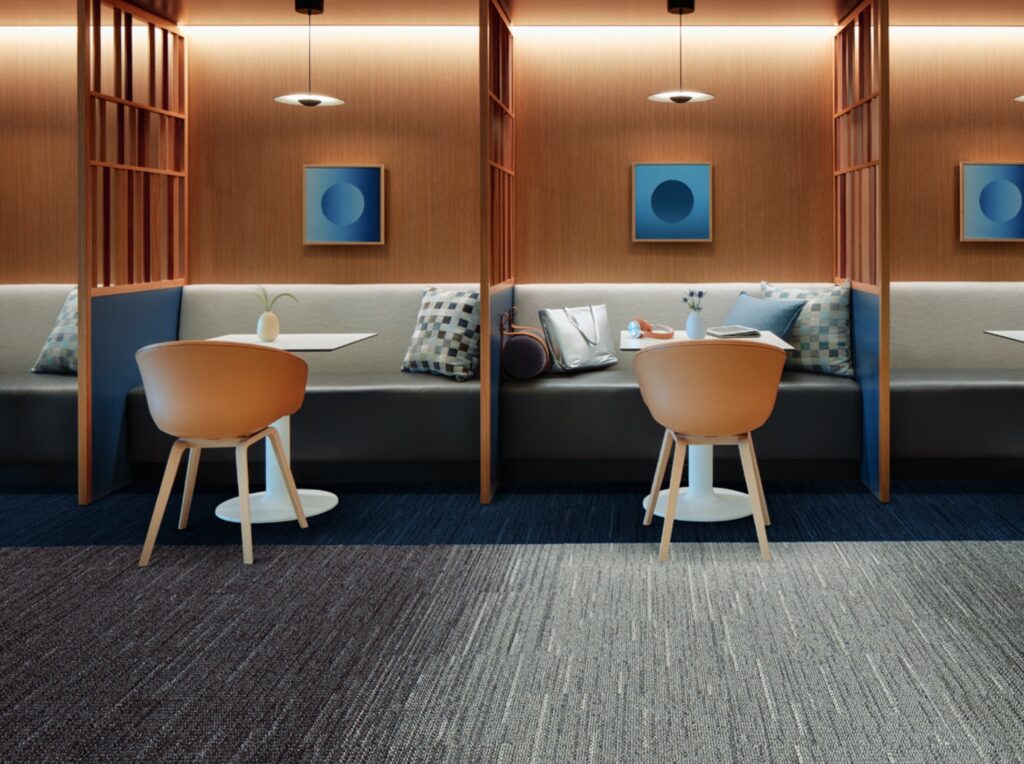
The result is a seamless illusion of a custom scheme, in which colors magically melt into one another across the entire expanse of the floor.
Woven Gradience is an extraordinarily tactile textile, with a raised surface that helps “bring familiar comforts into productive spaces while offering the flexibility to play it safe—or push what’s possible.”
The gradations of the tiles also invite an additional functional prospect: subtle changes can be used for directional cues/way-finding as well as to define space. Interface cleverly characterizes this as “blending in to stand out.”
Go to Interface to read more. And check out their Product Visualizer to create your very own virtual gradations. Also visit 3rings for more cool carpet tiles.
Related Posts


Popular Videos
Leave a Reply