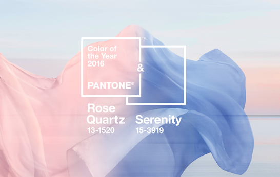
Rose Quartz and Serenity: Color Trend
Global color authority Pantone called out two colors for the 2016 edition of its 'color of the year' forecast. A blush pink called Rose Quartz and powder blue called Serenity. The pairing, according to Pantone, is part of a more unilateral approach to color – a commentary on the current societal movements toward gender equality and fluidity. Here we highlight 5 products that incorporate these calming hues.
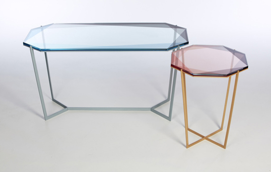
Inspired by the reflective and transparent qualities of gemstones, the Gem Side Tables by Debra Folz are available in three color ways including a blue and blush combination that channels Pantone's 2016 colors.
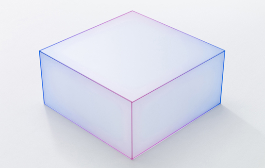
Soft by Nendo is a series of low tables made using fives sheets of frosted glass. The joints are colored using a gradient pattern then bonded together to give the effect of a blurred edge.
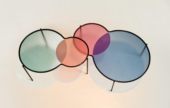
Designed for Ligne Roset, Hues by Outofstock are a set of nesting tables with colored glass tops. Inspired by the intersection of colors in venn diagrams, the table are offered in orange and green or blue and pink.
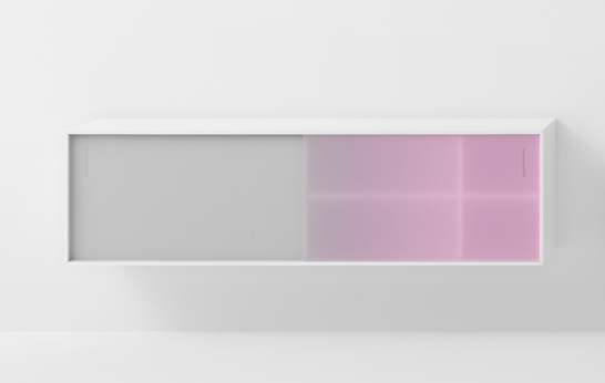
Known for their powerful color palette, Scholten & Baijings have taken a more subdued approach with the Shift range. Designed for Pastoe, the collection features cabinets with colored, transparent sliding doors, available in this light magenta gradient.
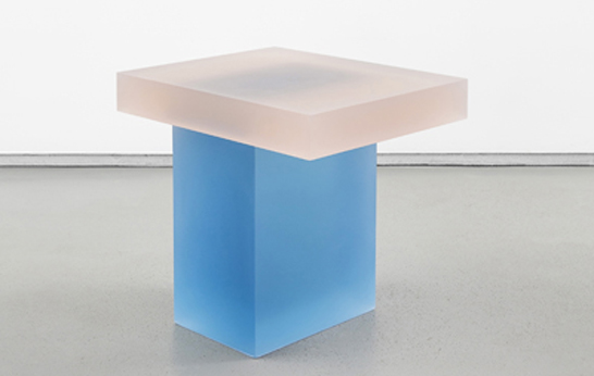
Wonmin Park's Haze stools are made using colored, semi transparent resin slabs. Park's Haze series come in a range of soft hues, including this blue and pink combination.

Leave a Reply