Moca’s Framed Buffet Will Cheer Up Your Negative Space
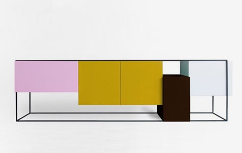
I like to think that the Framed buffet by Koenraad Ruys was in part inspired by the Belgian designer’s own name. Not that there’s an exact correspondence, but the varied textures and different heights of the piece evoke the visual ups and downs of Mr. Ruys’ first name, beginning with the authoritative and insistent peak of the “K,” moving down to the vast swath of negative space suggested by the “n,” arcing into the realm of regularity signified by the double “a,” and finally terminating with the open-ended potentiality of the “d.” Of course, this reading is up for interpretation, as Framed suggests a rather expressionistic take on the alphabet.
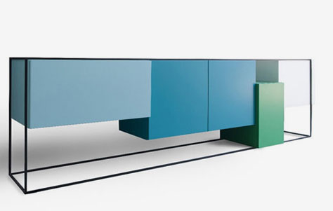
Framed buffet. Designed by Koenraad Ruys for Moca.
Multiple Perspectives and Many Hues
The other wildcard in reference to Ruys’ piece for manufacturer Moca is its three-dimensionality. The buffet is comprised of a rigidly linear steel frame dotted here and there with colorful components. While, strictly speaking, the piece is not modular, it does have a segmental or patchwork appearance, very like a child’s toy, in fact. Each compartment operates of its own accord—each is distinct in size, color, and function, except for those twin blocks in the center—which makes it especially appealing for kids, yes, but also for those who’ve transcended that epoch of fledgling-hood yet still have a yen for the bright and colorful and colorfully-stackable.


The above is meant to signify that Framed is fun in the conventional sense, but it’s also a draw for those interested in negative space—in the way that seemingly mundane cuboids can cohere into a delight for the senses of sight and touch. For with Framed, the visual modulations are well-nigh endless, as every different angle of perspective reveals intriguing new details, both within and without.
Via Otto-Otto.


Leave a Reply