The Enduring Vision of the Elements Work Station
Some 25 years back, when designers Pierre Mazairac and Karel Boonzaaijer formulated plans for their Vision range of cabinets—a series of “cubic mitred chests with no handles, various depths, heights and widths”—they knew the notion had its obstacles. First off, the dimensional flexibility of the modular pieces complicated manufacture: “New machines were needed to make it and hinges had to be designed especially for it… the standard-issue 32mm ones would not fit.” Balancing that extra expense with the uncertainty caused by a bold, new design generated no little amount of anxiety over its reception. Thankfully, the 1985 incarnation of Salone praised it to the skies; attendees relished its versatility, simplicity, and seamless, intuitive functionality.
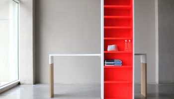
Elements work station. Designed by Pierre Mazairac and Karel Boonzaaijer
A Fully Integrated Cabinet System
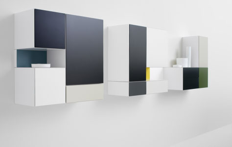
Not least among Vision’s visions was its handle-less operation. The 1985 version debuted a hidden pressure-release mechanism that facilitated easy-opening with a gentle touch. The feature confirms the length, width, and depth of Vision’s cubist aspirations, as it gives the modules their seamless appearance, thus helping to fulfill manufacturer Pastoe’s intent that Vision should “blend in with the home… be more of an interplay of line, space and surfaces than a standard cabinet.” In this respect, Vision is an intriguing contrast to last week’s Reef system, which wears its topographical contours on its richly-colored sleeves, so to speak.

Vision range Cabinets. Designed by Pierre Mazairac and Karel Boonzaaijer.

Vision range Cabinets. Designed by Pierre Mazairac and Karel Boonzaaijer.
Vision, to the contrary, aspires toward a kind of subtle camouflage, its stark geometricity deeding it the facility to integrate in among the natives. “Its components will adapt themselves to sideboards, TV chests or decorative wall art,” says Pastoe. Indeed, its components are decorative wall art. Looking at some sample arrangements of contrasting colors, I’m reminded of Mondrian’s comely cubes, for Vision makes it seem as if they’d come to the fully-dimensional realization of their potential, springing forth from the wall into the exceptionally functional form that is Vision.
And speaking of exceptionally functional, this year—just a scant few months after Vision’s 25th. Anniversary—Pastoe has announced the Vision Elements Work Station. This companion module takes the Vision of the cube and compresses it into the handy form of a thin rectangle (13.5cm high x 144cm or 108cm wide, to be precise). The addition not only provides a visually-interesting counterpoint to the shape and structure of the original, it also makes great use of floor and wall space, as it creates the perfect spot for a perfectly slim and optimally positioned work space.

Elements work station. Designed by Pierre Mazairac and Karel Boonzaaijer.


Leave a Reply