Cats on your Furniture? SerraydelaRoche’s Gat Chair Knows All About it
Like other architecture/design notables such as Claesson-Koivisto-Rune and Lievore-Altherr-Molina, the Barcelona duo of Ferran Serra Solá and Oscar Vera de la Rocha, is becoming in some ways a singular entity, notwithstanding their pronounced individuality. Rather than resisting this collaborative pull, however, the two have seized on it to create SerraydelaRocha, a design studio or, in their words, “means to incorporate innovation and product differentiation in order to achieve a final and lasting competitive edge in an increasingly difficult market.” Since we’re already dealing with translation from the Spanish, I’ll attempt a conceptual translation of same: “good design is new.” This may seem simplistic, but it’s apropos of SerraydelaRocha’s point as well as their latest design: the Gat Chair debuted at the recent Maison&Objet in Paris, where it struck onlookers as singular, memorable, and strange—a trio of descriptors that further helps us define good design.
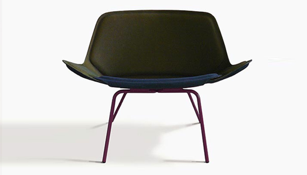
Gat Chair. Designed by SerraydelaRocha.
A Chair in Motion While at Rest
Among the many enchanting aspects of Gat, its resemblance to a cat is not among them. Being a dog man all the way, I couldn’t resist this easy barb, nor do I believe it, for rarely have I seen the animate aspects of one of nature’s creatures captured so effectively in a stationary object. Gat (geared for an international audience, the chair also goes as “Gato” and “Cat”) dynamically captures the characteristic pose of the “four-legged, butt-up stretch” that appears to rely on the cat’s unique anatomy (and psychological disposition). If this doesn’t sound familiar, picture a cartoon cat standing on all fours while the mid back arches inexplicably and seemingly contrary to anatomical limitations.
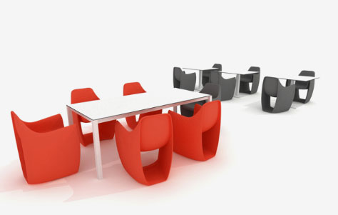
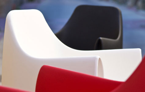
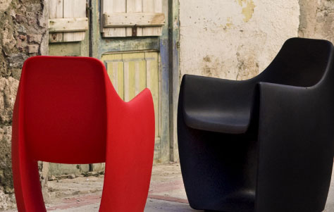
Gat looks like a cat in mid-stretch, the back rounded while the underbelly tucks up to create a surplus of negative space. The concept gives the chair an intriguing aesthetic as the bottom half of the piece becomes a transparent window of nothing, imparting an overall lightness that’s simultaneously the piece’s structural lynchpin. The feature also establishes the implied motion alluded to previously, giving Gat a harmonious aspect that jibes with a cat’s innate knack for instinctual and fluid movement. Given my predisposition for animal companions it’s hard to admit, but there’s no denying that the beauty and ease of Gat make “Cat” a better A&D metaphor than “Dog.” The truth of this is put succintly by SerraydelaRocha themselves: “Our cat, just as a true cat should, lives in balance and harmony with nature, prepared for survival and respectful of its environment.”


Leave a Reply