Follow the Unruly Guidelines of Frederik Roijé
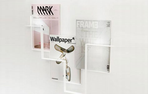
"Products have a habit of disappearing because of their functionality," says designer Frederik Roij©, "I want to prevent this by giving products an additional value." These words ring true with his most recent work that he calls the Guidelines magazine rack.
Guidelines magazine rack. Designed by rederik Roij©.
Wall-mounted and virtually flat against the surface, Guidelines displays issues of your favorite subscription as if they were pieces of art on the wall. The rack itself is made from bent, or folded, metal strips fused together, then colored in your choice from a vast assortment of shades. The end result creates interlocking squares of different sizes in a geometrical fashion. Although the racks are not completely symmetrical, the simple lines that form the rack itself look like a sketch by pencil that has leapt off the page.
In order to appreciate the unique, individual works of a young designer like Roij© one should get to know his background. Raised in the eastern part of the Netherlands, he graduated in 2001 from the Design Academy in Eindhoven and went on to intern at both Piero Lissoni in Milan, and Marcel Wanders in Amsterdam. His attraction to interior products started in his formative years and, as you can see, continues to drive his practice that has remained in Amsterdam.
Now, Frederik Roij© is a international design agency designs diverse products for brands and for market as for private clients. The office is renowned for its creativity and innovative designs. Our approach to reach a new level in product or space. Furniture, lightning, interior and industrial design are part and parcel of the services provided.
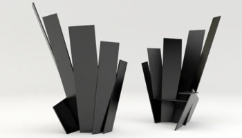
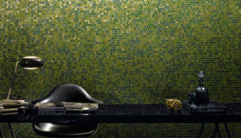
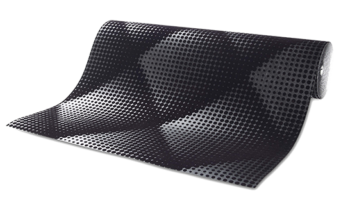
As an international design agency, Roij© designs furniture, lighting, interior and industrial pieces for both clients and brands that parallel his creative vision to develop the products that stay with us, involving a refined look to a product that surpasses its functional qualities with uncluttered class.


Leave a Reply