The “Sophisticated Deformation” of Thomas Feichtner’s Drawing Light
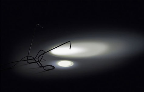
Sometimes simplicity is best. One might even say that it is in simplicity that one discovers complexity. This paradoxical notion may have been the impetus behind Thomas Feichtner's Drawing Lamp. As the name implies, this light is meant to illuminate the workspace, notably one's drawing workspace, notably the designer's own drawing workspace-"a lamp preferably used by the designer to illuminate the drawing area." Its design enables it to be positioned in two ways: one illuminates the entire area, while the other sheds focused light in a particular spot.
Drawing Light. Designed by Thomas Feichtner.
The way Drawing Light metamosphosizes is oddly simple: "The light is not focused via a complex mechanical system or by adjusting a reflector but simply by putting the whole lamp into a horizontal position." If you want more area illuminated, position the lamp vertically. For task lighting, place the lamp horizontally. A basic motion, to flip the lamp, controls the entire lighting endeavor. And, as we all know, sometimes less is more.
Made of steel tubing and LED, Drawing Light incorporates the illumination source into its construction material. Here I'll let Feichtner do the talking, because his meandering explanation for the uncomplicated Drawing Light is itself a study in paradox: "The conclusive implementation of the simple construction, with the cable running through the tube to the illuminant-the destination point and the source of light-was made possible by LED technology. LEDs do not require a reflector to concentrate the emitted light, and thus it was possible to simply put the LED into the tube." What remains, after everything extraneous has been removed, is essential, as transparent as a bare bulb. We're left with an "interplay of angles, radiuses, and lines" that sparks one's visual imagination. In looking at Drawing Light, one will see what one sees-like raccoons in the clouds or the Lorax in your latte. "¨
Via Yatzer.


Leave a Reply