Tasty Wallpaper by Flavor
You’ve got to love a company whose p.r. material gets right down to brass tacks. Especially when so much depends on user interface with a manufacturer’s website, it’s refreshing to encounter a virtual presence that spares you the tiresome flash intro or the trendy hipster ambient music. Brooklyn- and New Orleans-based Flavor Paper is just such a one. And the name pretty much says it all. With categories like “geometric” and “funky,” in addition to standards such as “floral,” and “traditional,” Flavor offers up some 100+ designs.
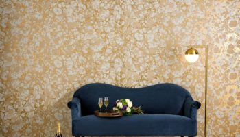
Flavor Paper.
Add options like interchangeable inks (enabling customized color selection), as well as consumer-created patterns, and we enter into a terrain of exponential possibility. And I haven’t even mentioned the seven new flavors that Flavor will unveil come the AD Home Design Show March 18 -21. These impressive additions include work by four designers: Jon Sherman, Josh Minnie, Emily Minnie, and Dan Funderburgh, whose cumulative efforts have resulted in seven new categories: “Fruits of Design,” “Iris,” “Not Wood,” “Farmer’s Market,” “Power Plant,” “Sharp Descent,” and “Shore Leave,” each of which features a striking new design with four color options.
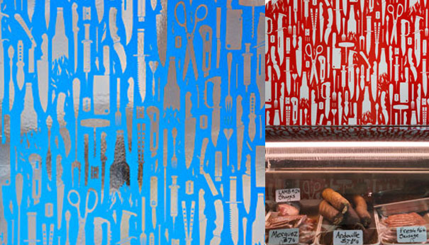
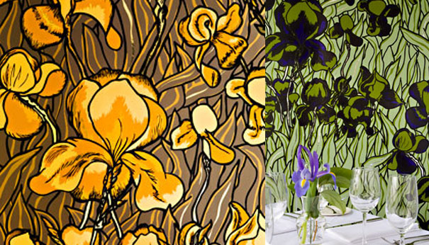
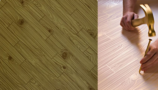
Space precludes a comprehensive treatment of each, so I’ll content myself with a quick glossing of my three favorites. Funderburgh’s Sharp Descent is definitely the cream of the crop. Not so much because I’d actually choose to adorn my own walls with this cascading shower of kniver, scissors, hypodermic needles, broken bottles, and razorblades, but rather because the paper possesses a striking aesthetic, a profound appreciation of the absurd, and a decided political agenda–definitely a philosophical compatriot of such apocalyptic-minded pieces as Chris Rucker’s Lounge Series and Studio Job’s Industry Table. Next comes Jon Sherman’s Iris. Styled after the preferred foliage of none other than Vincent Van Gogh, Iris takes a pointed stab at reproducing that master’s knack for the hyper-real. In rich, buttery yellows against a backdrop of staid browns and blacks, Sherman’s flowers threaten to leap off the walls and banish all sense of distinction between inside and out. Lastly, I’ll go with Josh Minnie’s Knot Wood, a clever re-capitulation of the stuff that typically constitutes floors, albeit in the unorthodox shades of royal, peacock, pale gold, and penny. Minnie’s design has a decided sense of humor, deeding those who share his sense of whimsy the ability to turn their modest bungalows into a sort of pseudo contemporary cabin.
Sharp Descent. Designed by Dan Funderburgh for Flavor Paper.
Iris. Designed by Jon Sherman for Flavor Paper.
Knot Wood. Designed by Josh Minnie for Flavor Paper.
Flavor paper comes standard in untrimmed 27 inch wide by 15 foot long single rolls. And–in a rare departure from the usual fare–the company actually discloses prices on the website: single rolls begin at $150. That’s a price point that makes Flavor a tasty option indeed, so don’t deign to take advantage of this company’s offer to “produce unique vintage, contemporary, and custom handscreened wallcoverings that will add a burst of flavor to any room.”


Leave a Reply