Signature Shelf by Metaconcrete
This week’s posts have definitely had a marked apocalyptic bent. After Monday’s treatment of Victor Barrish’s topsy-turvy Disaster, and Tuesday’s look at Hafsteinn Juliusson’s hyper-kinetic In Between Lightnings, Today’s post scrutinizes the Korean firm Metaconcrete and the poetic and strange undulations in metal that they call “Signature.” The name resonates on several levels. The piece has an asynchronous, discordant, even childish, silhouette for an A and D product, but—very like the personal and spontaneous and often-surprising lines of an individual’s mark and seal.
Signature Shelf by Metaconcrete.
“Signature” poses a language well beyond the right angle or the straight line. The more I ingest the piece, in fact, the more I’m tempted to liken it to traditional far East forms of expression. The correspondence between Signature and the ancient art of calligraphy is unmistakable—both offer an oscillation between thick and thin lines, between the bisected plane and the free expanse of negative space, between the vertical and horizontal. I’m also intrigued by “Signature’s” materiality. The languorous, persistent curve of the flat metal sheet that constitutes the horizontal plane is sinuous and jarring at once, inviting tactile exploration.
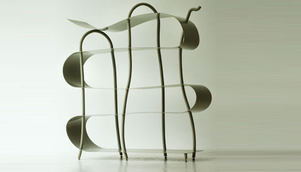


Some critics have lambasted the piece as juvenile, as folded “trash” or non-utilitarian experimentation. In defense of Signature, I can only say that art (and design) should invite the latter, and that with increasing frequency, designers (and artists) are incorporating “trash” into their work. Such is the case with Signature, a piece that employs so-called detritus to create its “Signature” uneven surfaces and harsh penetrations. I’ll be the first to allow that the piece surpasses an “organic” aesthetic, to affirm that it reaches beyond the familiar and toward something even more elemental and bizarre. I’ll also be the first to say that that’s just fine with me.

Leave a Reply