Redux X 2 = Jarl Fernaeus’ Sideboard and Lamp
As readers may know, one of my favorite pastimes is unpacking the meaning of a term or phrase in order to delve more deeply into a designer’s intent. This matters because, quite often, the surface signification is only the first, most obvious level of meaning and only once we explore alternative possibilities does the true nature of a product, design, work of art, etc… begin to shine through. The Redux Sideboard and Redux Naked Lamp by Swedish designer Jarl Fernaeus piques my curiosities in this way… So I guess it’s off to the dictionary.
Redux Sideboard and Redux Naked Lamp. Designed by Jarl Fernaeus.
1. Redux: brought back; restored; used again; re-done.
2. Redux: the generic name of a family of phenyl-formaldehyde/polyvinyl-formal adhesives.
3. Redux: the commercial name of a weight-loss drug based on dexfenfluramine hydrochloride.
For brevity’s sake, I’ve omitted other amusing possibilities here (such as the title of an Adam Ant album and the name of season two of the TV show Smallville), but the three remaining definitions give me enough fodder to investigate Fernaeus’ aims for his complementary sideboard and lamp, the former constructed of Corian and powder-coated sheet metal, the latter a minimalist exercise of bare bulb wrapped in a grid of thin metal bands. So what exactly is being re-visited here? The lamp evokes the burgeoning era of the Victorian age, when London’s streets were illuminated with gaslights made of wrought metal; the sideboard speaks of synthesis to me, showing influences from the simplicity of the Quakers on up to the vertically oriented ornamentation of Art Deco.
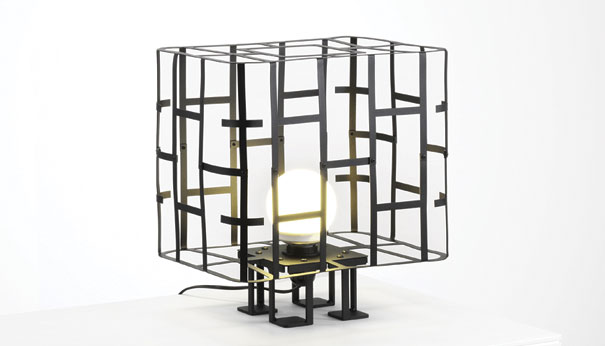
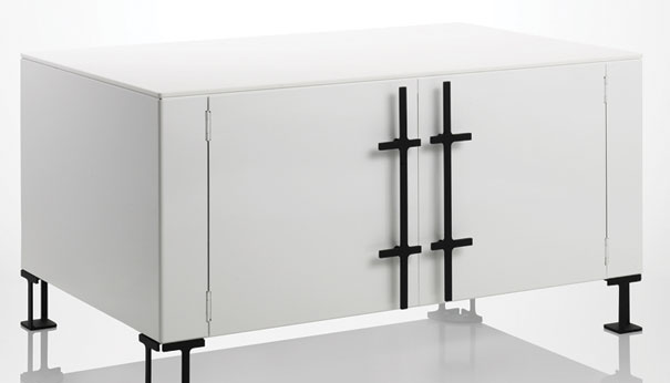
As for meaning number two I can only speculate, though some part of me likes to imagine that Fernaeus has some rather particular leanings where adhesives are concerned. And meaning three? I chalk this up to the slim aesthetic of sideboard as well as lamp, both of which display a pronounced geometricality and sparse ornamentation.
Of course, the real punch of the piece is in meaning number one: the term Redux does the double work of recalling the past while articulating the future, a dynamic that’s quite pronounced in Fernaeus’ duo. In the way both pieces give a hearty nod to past influences while creating something entirely fresh, the ensemble gets at the essence of the term. Fernaeus (whose varied interests include the history of typography) is highly cognizant of this balance between a high degree of functionality, an intelligible aesthetic, and a provocative appearance: “(design) must have a clear expression of form while being charged with energy. At the same time I want things to work together and be used over time without users tiring of them.”
Via Cubeme.
Leave a Reply