Haffsteinn Juliusson’s “In Between Lightnings”
One thing I can say about product designer Hafsteinn Juliusson is that we haven’t seen his like on 3rings before. This is true not only in regards to his nationality (Icelandic), his production philosophy (“I try to avoid mainstream mass production… that’s probably the reason why all my projects so far are one-off prototypes”), his website (the landing page features a passport-sized photo of Juliusson bouncing off the frame’s edges while trailing a trio of psychedelic colors), but especially concerning his “In Between Lightnings” installation/lightpiece/luminescent-imaginative rendering of the idea of illumination.
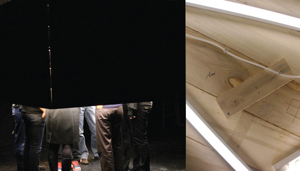
“In Between Lightings.” Designed by Haffsteinn Juliusson.
Given the spontaneous, slap-dash character of this most inspired notion, I’m not sure Hafsteinn is ready for prime time—nor would he seem to wish this, given the avant-garde nature of his projects. “In Between Lightnings” joins the ranks of Victor Barish’s “Disaster” for its playful inversion and debunking of certain sacrosanct beliefs, as, for instance, the idea that the light should adorn the room, rather than the room adorning the light. The latter formulation is precisely the concept behind In Between. The project consists of a floor-less, ceiling-less four-walled room of flat wooden planks whose interior is decorated with all manner of lighting implementation (fluorescent bulbs as well as coils and stacks of electrical cords). Juliusson characterizes the piece as an experimental foray into the idea of illumination: “fashioned from a neo-romantic notion, the lamp functions as an inside out chandelier… the idea was to produce a raw, stripped piece, capturing a youthful street feel characterized by experimentation, spontaneity, adventurous excitement and audacity.”


This mission is certainly accomplished. Juliusson’s project re-thinks the idea of how we interact with A & D product by expanding familiar notions like “lightpiece” and “room,” and then re-envisioning the traditional human-product scale by granting us literal entry into the light’s inner workings. The resulting “product” is high on the whimsy quotient, to be sure, but it yet creates an intriguing aesthetic, in addition to challenging long-held notions about room layout. In sum, don’t look for “In Between Lightnings” at a retailer near you anytime soon, but come next December, you might just find it (or other of Juliusson’s burgeoning projects) amid the many artful efforts of Design Miami.


Leave a Reply