Dylan Gold’s Cornered Low Table
I suspect I’m not alone in my admiration for long, expansive counter-top spaces—especially when they’re outfitted in resplendent wood veneer or gleaming granite. Just so, I’m equally certain that many share my repulsion for the ubiquitous clutter of junk mail, coffee mugs, and assorted household trinkets that tend to pollute these environs. Designer Dylan Gold—whose sunny complexion and San Diego roots seems befitting of his quintessentially American name—has made some serious headway in the war against counter-top refuse.
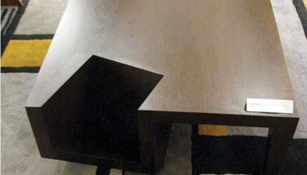
Cornered Low Table. Designed by Dylan Gold.
The piece in question is a handsome low table called “Cornered” that features a singular smart innovation: one of its four legs has been swapped out for a cube-shaped nook that easily accommodates books and magazines. Made of recycled MDF and FSC-certified walnut veneer, the piece evinces a “form follows function” ethos. In re-thinking the conventional model of a low table into a furnishing with an enhanced functionality, Gold has achieved a compelling aesthetic: Cornered manages to be avant-garde and classically modern at once. The “cross-section of a rotated cube” works well within the bounds of the clean-lined, geometrical look that Gold is after, while simultaneously transforming the table from de rigueur to innovatory.


The M+D+F show in San Francisco seems to agree with the above. They awarded Gold the Best in Show for “a fun concept that had perfectly realized details and finishing… the concept of the fourth leg being replaced by a book or magazine display nook is so obvious, we were a bit surprised it had never been done so well before.” As with most displays of bona fide ingenuity, Gold’s Cornered just makes good sense—so much so, in fact, that we seem collectively incredulous that the idea is so new. Of course, this observation is easy to make in hindsight, and Gold thought of and executed it first, long before we all slapped our heads and said, “It’s so simple. Why didn’t I think of that?!”


Leave a Reply