Mikou Design Studio’s Lighthouse Tower
Here’s what we know about the project proposal/prototype called “Lighthouse Tower” by Paris’ Mikou Design Studio: 1. It’s 35 stories high, 5,000 square meters, and 20 million USD; 2. it intends to expand the notion of “lighthouse” into an emblematic civic icon housing “observation points, an auditorium, skywalk, bungee jump platform, climbing tower, gyrodrop, cafétéria, souvenir store, urban balconies, and multi-usage space.”; and 3. It’s well nigh transparent.
Lighthouse Tower. Designed by Mikou Design Studio.
This last quality is perhaps the most distinguishing feature of the proposed structure, which may (or may not) soon inhabit the island of Cotunduba, just off the coast of the most renowned of Brazilian cities. Mikou touts the aesthetic of the Lighthouse Tower as very much in keeping with the blue skies, crystalline waters, and pervasive light of Rio: “made of sensitive perceptions of light, sound, atmosphere and sensual experiences related to its geographical and urban location, Lighthouse Tower is an abstraction of the female form…” Others take issue with this characterization, describing the hypothetical project as an “eyesore,” a “blob with a hole,” and a “thing” that will destroy one of the most beautiful views of the city.
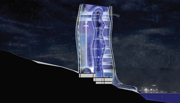
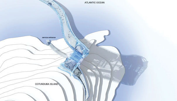
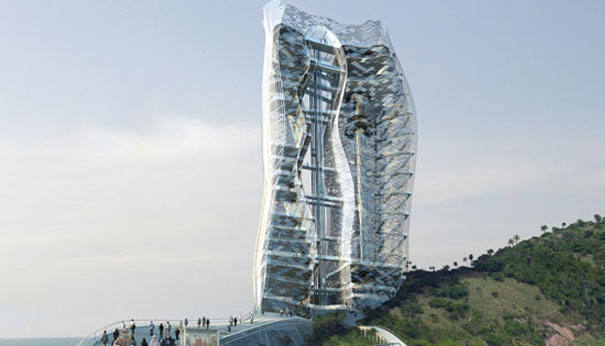
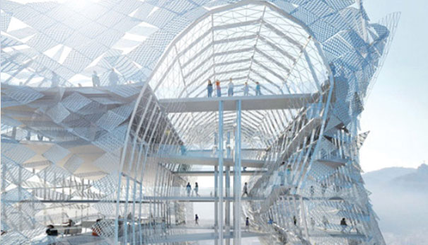
As with most contentious architecture, the truth is likely midway. Mikou’s artistic renderings of the tower present an organically-themed structure with certain resemblances to (in no particular order) a paramecium, any number of insectivorous or crustacean life forms with translucent exo-skeletons, Superman’s “ice palace” (had it been re-located to Dubai), and a bubbling-over test tube as conceived by Salvador Dalí.
The look of the proposed structure is certain to be just the tip of the proverbial iceberg, as the incipient cavalcade of controversy re: cooling costs, utility, functional space, environmental impact, and funding will doubtless show. As you might have guessed, my initial reaction is fraught: on the one hand, I say kudos to Mikou for the re-conception of an historically utilitarian structure into a usable public space with a distinctive aesthetic; on the other, I blanch at the thought of what is essentially an organicized version of Van der Rohe’s “glass box” on the verdant hills of Rio’s shore.
Via Designboom.
Leave a Reply