A New Piece From Vladimir Kagan: The Crescent Sofa
If—like me—you’re occasionally prone to philosophical-historic ramblings as regards the nature of the evolving contemporary aesthetic, here’s a name to supplement your musings: Vladimir Kagan. With the somewhat humble origins of Worm, Germany, circa 1927, Kagan was fortunate to have emigrated to the U.S. in 1938. From an early focus on painting and sculpture he evolved an interest in design, eventually studying architecture at Columbia and learning woodworking from his father, Ill Kagan.
The Crescent Sofa. Designed by Vladimir Kagan.
Vladimir wasted no time in making a permanent mark on design—after opening his first shop in 1948, a mere two years later he debuted his signature Serpentine Sofa, a piece that boldly broke from the rigid linearity of the era to herald a new age of curvaceous contours and sexy silhouettes. Indeed, the organic forms of the Serpentine Sofa “liberated seating from the walls and created an entirely new interior landscape.” The piece influenced the aesthetic of countless designers and artists—everyone from Andy Warhol to David Lynch; from Jean Marie Massaud to Karim Rashid; and even Kagan himself.
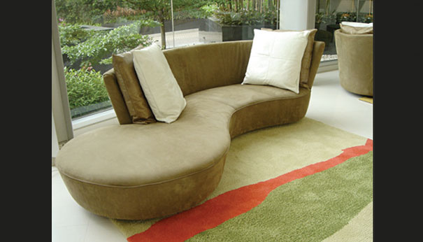
The Crescent Sofa. Designed by Vladimir Kagan.

The Crescent Sofa. Designed by Vladimir Kagan.
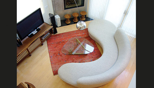
Serpentine Sofa. Designed by Vladimir Kagan.
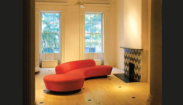
Serpentine Sofa. Designed by Vladimir Kagan.
For how else to explain his recent Crescent Sofa, a piece that, “inspired by the classic Serpentine… has a smaller footprint, making it more adaptable to most environments.” I guess a designer with the impressive longevity of Kagan (at the top of most “best” lists for about 60 years) is entitled to this sort of auto-influence, especially when the appropriation evinces a profound appreciation for contemporary realities. In a nutshell, Crescent downsizes the majestic sweep of Serpentine without diminishing its pronounced wow factor. Like its famous ancestor, Crescent is unabashed in its joyous display of joyful asynchrony, while acknowledging the need for more modest proportions. This slimmed-down version of a classic is ideal for smaller spaces—it evokes the epochal statement of Serpentine, without making too much of it. All told, Crescent represents the best kind of re-visiting: a skillful balance between the romance of the past and the demands of the present.




Leave a Reply