Tafekstukken by Daphna Isaacs Burggraaf and Laurens Manders
There are words in different languages for concepts and objects that do not exist in English. One of these words stuck in the netherworld of language is the one meaning “the re-occurence, or awareness of subsequent occurences, of something you recently learned about.” That’s a poor definition perhaps, so I’ll put it in lay terms: when you learn about something and then it pops up everywhere. Recently, everything’s coming up Netherlands. I see a couch I like, it’s from the Netherlands. I discover a new architecture firm, it’s from the Netherlands. And here’s one more item of noteworthy Netherlands: Tafelstukken.
Tafelstukken. Designed by Daphna Issac Burggraaf and Laurens Manders.
The only real difficulty in covering anything or anyone from the Netherlands is getting the spelling all correct. Though it’s not quite as difficult for my eyes as Turkish words, I do have to double check all the double consonants and double vowels—and I’m admitting this weakness in case I should slip and mistakenly add or subtract a letter (my apologies in advance). Designed by Daphna Isaacs Burggraaf and Laurens Manders, Tafelstukken Centerpieces reinvent the traditional centerpiece. Presented at The Dutch Design Week Eindhoven in October, Tafelstukken is as lovingly described as it is animated: “The centerpieces stand out by shining upon themselves and their contents. By using a combination of shape, material and light three quaint characters arise.”
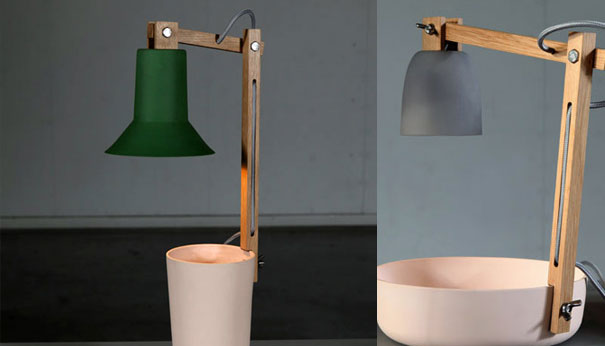
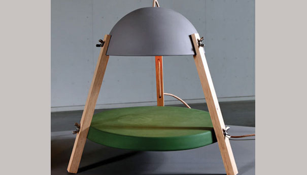
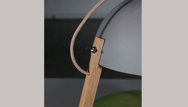
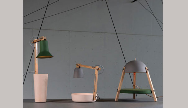
Daphna Isaacs Burggraaf and Laurens Manders obviously have the inimitable sense of whimsy I’m discovering with the Dutch. Tafelstukken creates a series of shapes that seem animatronic, kinetic, and robotic. The light shades invariably appear like heads, with one looking to me like a helmet—and who doesn’t want a helmet-wearing creature as a centerpiece? In case you can’t go for the anthropomorphizing, Tafelstukken will also appeal to those who adhere to elemental shapes: the circle, line, and cylinder. Touches of green and grey work against the matte wood of the lamp/centerpiece to create a textural push and pull. The shiny light echoes this juxtaposition, since its luminosity shows off Tafelstukken’s matte parts. The visibility of the construction—wingnuts and electrical cords—adds to the centerpiece’s allure, since it’s at once transparent and playful. This is how I’m put together, Tafelstukken says. And unlike Frankenstein, Tafelstukken revels in its bricolage.


Leave a Reply