At #NeoCon09: Poliform’s Twelve – Let Me Count the Ways
Never one for numerology—and professing a natural enmity for easy answers to inscrutable conundrums, a la The DaVinci Code—I yet find myself rapt in contemplation at the significance of Poliform’s enigmatic moniker for their most-recent Varenna kitchen concept. “Created from the research of a new essential design with minimal horizontal thicknesses and maximum wideness of the surfaces… ‘Twelve’ represents a new proposal expressing an evolved and informal living concept.”
Twelve. Designed by Carlo Colombo for Poliform.
Not so sure the answer lies within that tidbit, but maybe “evolved” is a crucial clue. For if “Eleven” represents repetition and eternal return (a surpassing metaphor for James Joyce and his Finnegan’s Wake), might twelve signify the best kind of progress? The kind that acknowledges and incorporates the past while debunking and moving beyond its shortcomings? For such could indeed be claimed of Twelve, designer Carlo Colombo’s contribution to the kitchens of the future. As I’ve alluded to above, Twelve is an enticing fusion of vintage and futuresque elements—or better I say “vintage futuresque” and “future futuresque”—since the design smacks of the high polish and severe rectilinearity of 50s and 60s schemes, albeit absent the often garish palette of greens and browns that pervaded the landscape back then. Wisely swapping these tones out for a profusion of icy whites, chromes, and grays (with the addition of the occasional dark oak for contrast), Colombo succeeds in both emphasizing and down-playing the horizontal width/thickness dynamic referenced above.
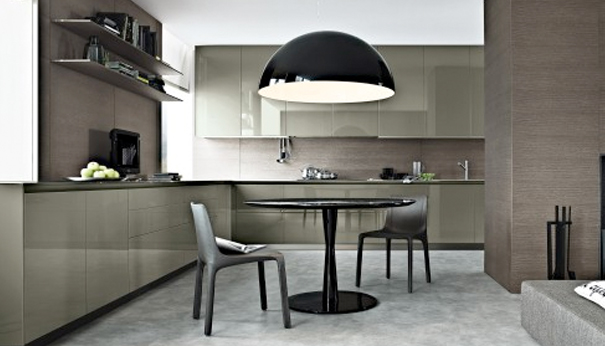


The strategy suits the “form follows function” paradigm, since the emphasis on conservation of materials (maximizing usable space while minimizing the volume of structural elements) creates a favorable surface area/floor space ratio, while also establishing the unique aesthetic. And on that score, the dominant impression of Twelve is somewhat similar to that of the recent Mondart Modular system for Porcelanosa: razor-thin, sharp and severe and somewhat clinical, but overwhelmingly utilitarian. Both hearkening back to the age of pure modernism (“clean” geometrical shapes, minimal embellishment, an emphasis on an aesthetics of structural elements), and embracing the resource-conscious ethos of the new millennium (minimizing use of floor space, handle-less cabinetry), Poliform’s Twelve synthesizes the best of the past with the exigencies of the future. How very twelve indeed…
See Twelve and other of Poliform’s innovative kitchen designs (Thirteen? Fourteen?) at #NeoCon09, June 15-17.


Leave a Reply