Z is for Zeta
Architect Diego Granese likes to incorporate design into the spaces he executes in order to “reach a larger homogeneity in the final result.” Given the interesting shape and color effects of his bent glass table appropriately named Zeta, I would love to see the building in which it was intended to housed. Surely, the rooms would contain lots of natural light, lots of glass, and perhaps lots of refractive surfaces. I envision it as the manageable version of the Beijing Aquatics Center (yes, we here at 3rings have not forgotten our darling of the year).
Zeta, glass coffee table. Designed by Diego Granese. Manufactured by Zeritalia.
Granese designed Zeta for Zeritalia, an Italian company that specializes in bent glass furniture. Founded in 1991, Zeritalia has been at the forefront of glass technology, enabling its designers to be liberated “from the technological restrictions normally imposed on their creativity.” In fact, Zeritalia clams to be the only European company to offer safe bent glass products. Because glass is a completely recyclable material, Zeritalia is also eco-compatible. The best thing about the Zeritalia, however, is their use of excellent designers, including Karim Rashid. So Diego Granese is in great company.
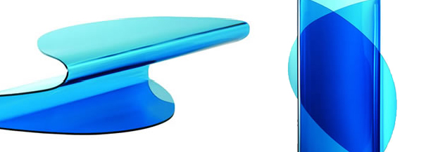
Zeta is a coffee table made from monolithic curved glass, available in a transparent or colored finish. At 10 mm thick, Zeta offers the sturdiness insisted upon by Zeritalia. The curve of the piece causes a play of light: Zeta’s folds create lighter and darker shades of blue (this is especially evident when seen from above, which should come in handy if you’re one of the many people who claim to have out-of-body experiences). Zeritalia explains that their collection is “a journey through the mind of man - his longing for lightness, for luminosity, for colour, for fantasy”-and the Zeta defines this aesthetic philosophy.
Zeta is perfect for sleek and sexy bedrooms, perhaps as a nightstand for the Air Bed-that would certainly be ethereal. The Zeta is also ideal for fun and adventurous offices (and yes, these do exist): what a fitting complement it would be as a magazine table in a waiting room whose desk is glowing from DuPont’s Illumination Series. In blue, Zeta obviously recalls sky and sea, making it a fashionable alternative for ocean-side hotels (in lieu of more literal nautical treatments). Granese’s Zeta can be fluidly integrated into any design; it’s a malleable piece in more ways than one.

Leave a Reply