MILK Does a Body Good
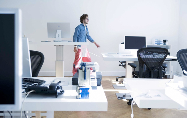
For anyone out there who watches the HBO show Entourage, Ari Gold’s office could use MILK, the sleek desk designed by Søren Kjær (website under construction).
MILK, desk. Designed Søren Kjær.
Auto Blog Pro >
MILK is the hipster’s desk and the geek’s desk all in one: undeniably good looking (in a forcefully unassuming way-like those mod haircuts some LA boys favor which look like artfully sculptured bedhead) and undeniably practical. When asked what inspired him to create MILK, Kjær’s response could actually be a bit of dialogue verbatim from Entourage: ” Oh man, I was dreaming of a desk that had all kinds of hotness.” Part of the hotness comes from MILK’s attention to surface area. The desk maximizes space by setting “drawers” below the top of the desk, the tops of which can be customized: they’re available in aluminium or chrome, polished or pebbled, black or white (or purple for the more adventurous-or the kingly). And these built-in slots “can be tailored to the user’s desire with a fish tank, bin, CD holder etc.” Like some strange hotels where the traveler can be provided with an in-room fish for companionship/calm-inducing properties, MILK encourages you to “Enjoy your fish!”
Notwithstanding the whimsy-and the MILK’s got whimsy in spades– Kjær’s desk is a hard worker. Visiting the MILK website, you’ll be greeted by pithy statements, one of which is actually a truism: “If work is your life, life just got really good.” Particularly for those of us who work with Macs, MILK takes into account what a contemporary computer desk should do. First of all, leg space: MILK’s central column provides lots of room for unruly knees. Short or tall? No matter, since MILK uses a pneumatic lift to adjust height-just press the easily accessible button below the desk (which also makes desk-sharing less contentious). Kjær explains that MILK “reminds [him] of the Steelcase Airtouch with less pneumatics and more slots”-this sounds a little sexual to me, but then the MILK is the far sexier of the two.


And special mention here is owed to MILK’s technophilia (perhaps technorealism): the desk comes with two cable exits for neatly bundling and directing wires AND a cable drawer for further controlling the corralled cables (works like a glove box). These details help maintain the minimalism of MILK.
We can thank Kjær’s narcissism for most of MILK’s genius. He readily admits that his design philosophy boils down to one question: “Do I want this?” In the case of MILK, he wanted “a desk that was simple but never boring,” “smart but not overly sophisticated,”-in short, “a desk worth falling for” (see, I’m not the only one to pick up on the sexual undertone). Personally, I love an ego-if it’s justifiable. You can toot your own horn as long as it creates music, which is why I find Kjær’s self-aggrandizement as lovable as the irrepressible Ari Gold’s: “I designed MILK for myself, not for anyone else.” It’s just an added benefit, I suppose, that in fulfilling his own desires, Kjær has also tapped into so many of ours.
What’s next for MILK? Under consideration at the moment are a speaker, iPhone dock, charging pad for cell phones, and small LCD screen. MILK is now part of Holmris Hansen‘s line-a Scandinavian furniture maker for more than three generations (a nice juxtaposition, if you ask me-between old school and techno-hipsterism).
What’s next for Kjær? A kitchen. If he takes his cooking as seriously as he takes his Mac, then his culinary design should garner much interest. CPH Square will launch Kjær’s kitchen (katchy? isn’t it) this November.


Leave a Reply