Room for Change
Normally, personal design projects are few and far between. But in the past six months I’ve been tasked with designing two completely new spaces for our business and our (now growing) family.
Area rug manufactured by Karastan.
While every designer worth her salt loves the opportunity to ‘live in her work’ I’d be kidding myself if I told you I was an easy client. Truth be told, it’s often more challenging to design for yourself because there is so much at stake. You know you can’t wipe your hands of it once the design is complete. But overall my journey has been a terrific one, and I’ll be sharing the adventure with you throughout a series of posts on the process, the progress, the victories and (yes) the mistakes I’ll avoid in the future.
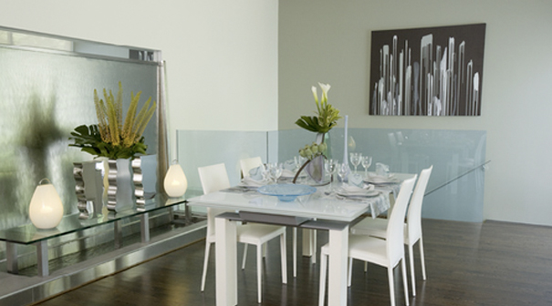
Let’s start with the office. Last fall we moved our company from a chic home office to a raw space we found through a series of marvelous coincidences. The office came with soaring ceilings, new hard wood floors, a sprawling brick patio at the front entrance, drive-up parking, hip neighbors and plenty of natural light. Best of all, it came with white walls. It was ready for anything. And, as you might guess, those shining white walls have the potential to overwhelm you with choices. At best, a blank slate fills you with wondrous inspiration. Other times, those empty spaces mock and taunt you. I was grateful that this particular space spoke to me immediately. It took very little time to devise a floor plan and overall design scheme.
When the project began, I had a color palette in mind at the outset and the rest fell quickly into place. (I had a little help from always on-trend Benjamin Moore.) Right away I found the perfect Karastan area rug to tie the colors together and anchor the space. The rug, Plum Blossom, has a slate blue/teal base with chocolate and gold accents. The palette was perfect. More importantly it was different from any palette I’d used in the past. Somewhere inside I knew the new colors and new surroundings would infuse our workspace with new creative energy.

Color palette inspiration courtesy of Benjamin Moore.
With the basic plan down,other details fell quickly in line. We needed a chic, upscale environment that encouraged creativity without being distracting. With street level windows we also knew we needed curb appeal for passersby. Low slung seating, floor-to-ceiling silk dupioni drapes, and an accent wall (which I will cover in another post) sealed the deal. As I looked around, I was thrilled with the results.
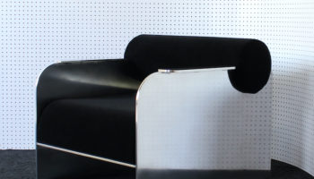
But as weeks passed, it became apparent that somewhere along the way form had taken precedence over function in my design. The low-slung modern chairs I’d found for the client seating area were stunning. I’d chosen them because they’d been inspired by Greek klismos chairs. Curved backs, rectilinear legs. Absolutely gorgeous. Not to mention how well they set off the rug. But visitors (and my husband) continued to ask if it was “okay to sit on them.” Hmmm… a seating area that doesn’t invite sitting? I knew it was an issue that needed to be resolved.
Some quick resourcing, clever use of Craigslist (to sell the pair of klismos chairs) and within ten days we had a terrific solution to our design dilemma: slipper chairs. They proved to be the versatile, chic solution we needed. Best of all, visitors to our office not only sat in them, they gravitated towards them. And to my delight, the new chairs look even better than my original duo, proving that form and function don’t have to be mutually exclusive.

Image courtesy of prior 3rings article: A chair fit for a King (or Queen).
Every project has its fair share of changes. It is the nature of the human experience. And often it takes time for a space to ‘speak to you’ and tell you exactly what is needed to fill a void. The lesson here is not to avoid mistakes, but rather to anticipate them and learn from the experience. In this instance, I should have followed by instincts from the beginning and invested more to obtain the chairs I really wanted (who doesn’t want a pair of iconic slipper chairs gracing their office?). But at the end of the day it worked out beautifully, and the proud new owner of those low-slung chairs is enjoying them in her showcase home.
In my next post I’ll share the grueling process of transforming the unsightly pegboard wall into a work of art (remember that accent wall I alluded to earlier?). Until then, remember to follow your instincts when it comes to designing a space you love. Trust me, those instincts rarely fail you.


Leave a Reply