
Sherwin-Williams’ Colormix 2024 Anthology: Volume 1
Sherwin-Williams proposes a whole new way to think about color trend reporting with Colormix 2024 Anthology: Volume 1. Rather than focusing on a single color—or a range of shades within a single color familly—the company’s biennial color trend report considers four key chromatic families: “Discover the lines where blue meets green, the softness and splendor of reds and purples, the solace of deep and dark tones, and the delicate touch of whites and tints.”
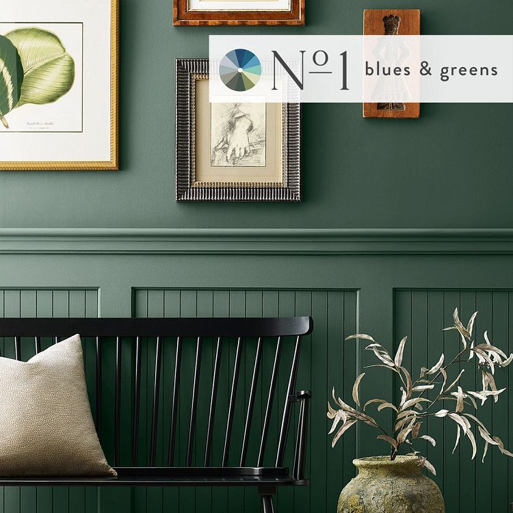
No. 1: The Convergence of Blues and Greens
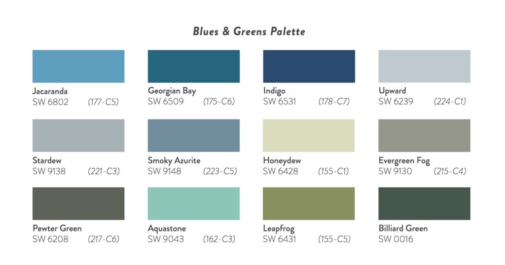
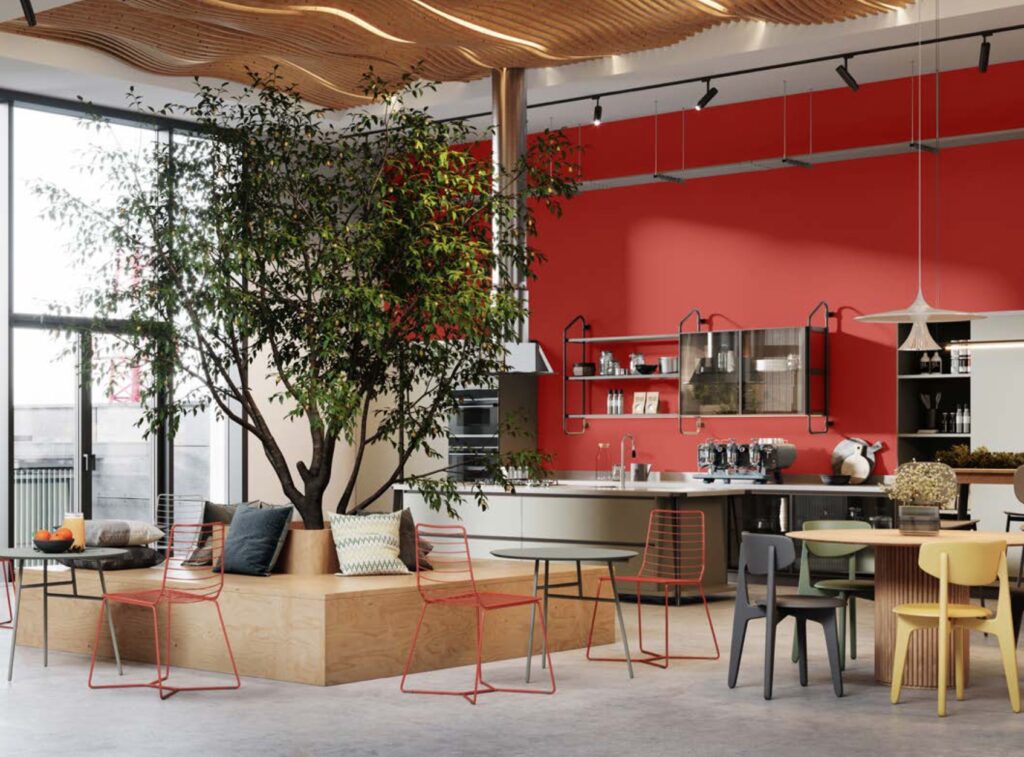
As colors that are inherently evocative of nature, blues and greens are front and center in the increased emphasis on wellness in the workplace. “Verdant color cues from nature” augment the biophilic effect of design features like plentiful light and views of the outdoors. Thus, the blues and greens of Sherwin-Williams’ Colormix 2024 Anthology help to reduce stress and enhance productivity in the workspace. The benefits accrue to other commercial spaces as well: healthcare patients can experience a greater sense of calmness, reduced stress, and faster healing times; students benefit from enhanced feelings of safety and improved mental health; and travelers enjoy the cohesiveness between outdoor/park-like settings and nature-inspired palettes in hotels.

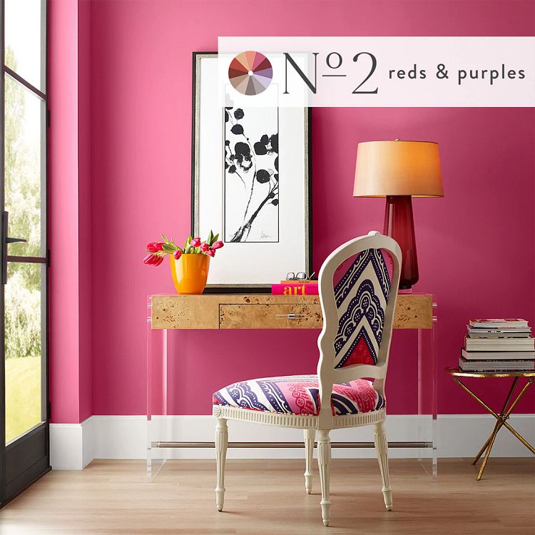
No. 2: The Poetry of Reds and Purples
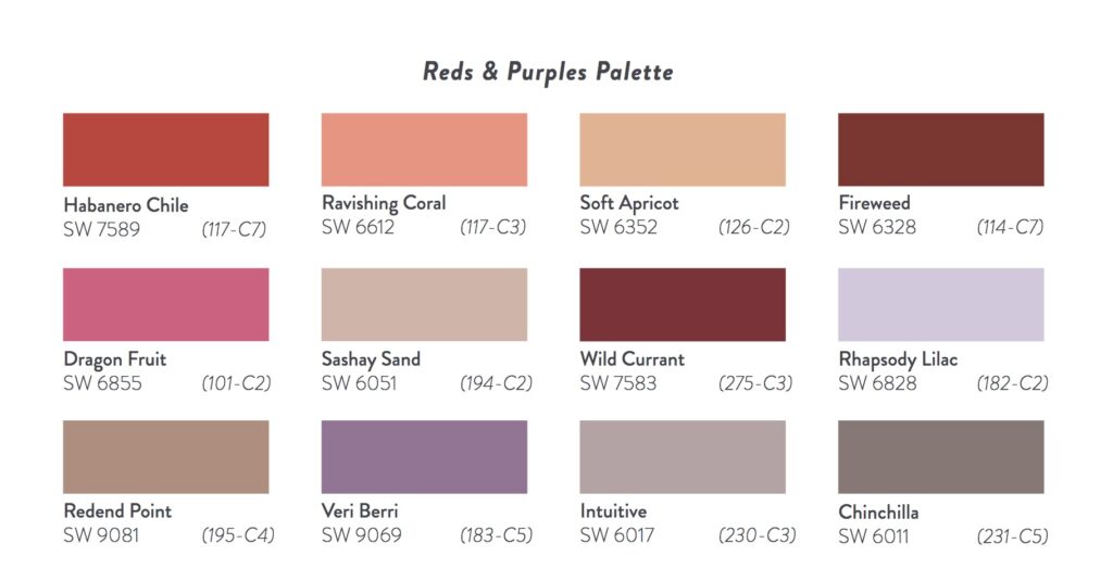
The Reds and Purples palette runs the gamut of these intense and evocative shades. From the fiery qualities of Habañero Chile to the calming and sedate feel of Rhapsody Lilac, these colors can be used to modulate mood: to stimulate dynamism and productivity or to foster deep introspection. Sherwin-Williams recognizes the strategic role of color in the commercial workspaces—this is perhaps most pronounced with the Reds and Purples palette. From instilling felings of camaraderie and inspiring creative exchange at work to establishing a sense of immersive elegance and luxury in hospitality venues, Reds and Purples set the stage for heightened emotions and memorable experiences.
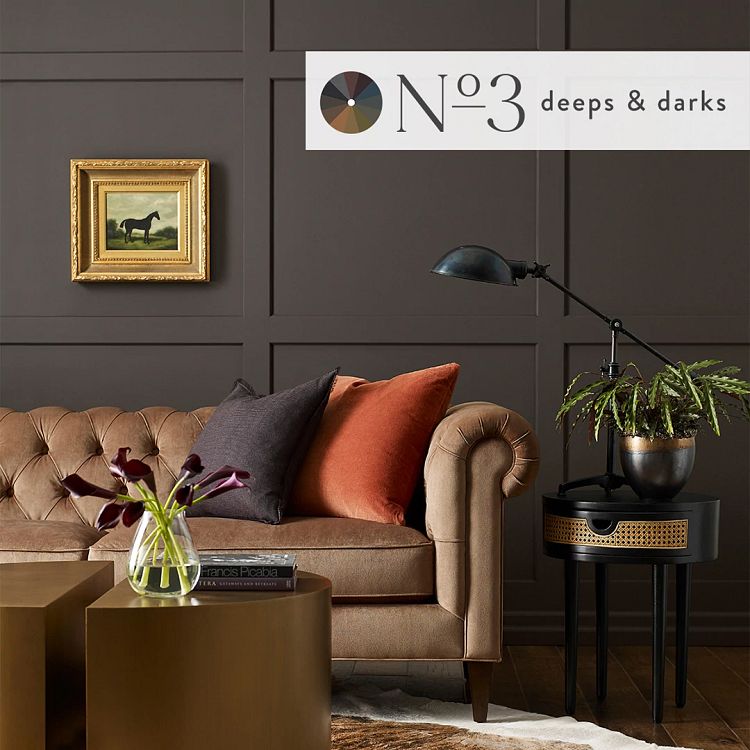
No. 3: Deeps and Darks
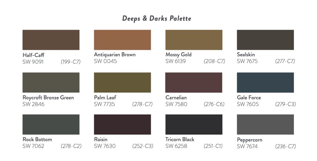
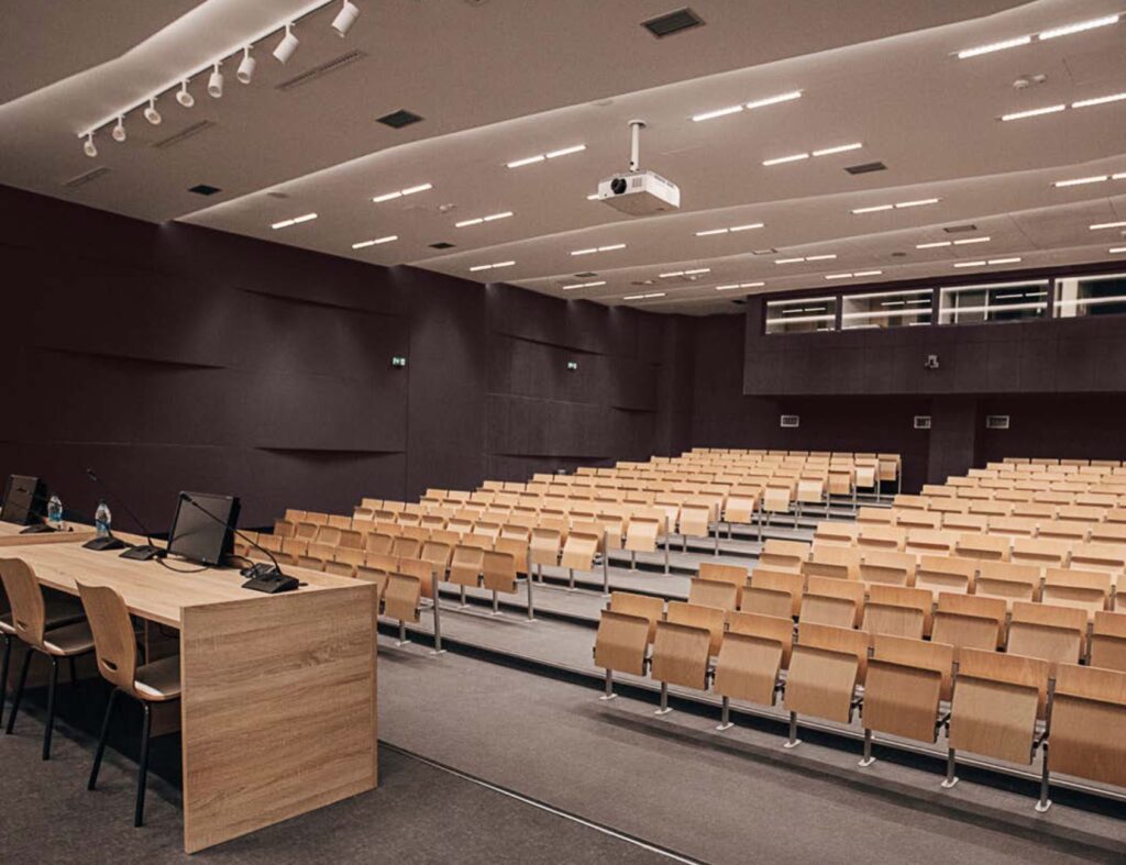
The Colormix 2024 Deeps and Darks palette eschews the reticence about overly dark spaces, recognizing how darker shades can create a sense of refuge—of coziness and of shelter. In commercial spaces, dark colors complement the modern, streamlined aesthetic. Rich browns and deep greens evoke the elemental appeal of forests, enhancing biophilic elements of spaces from offices to restaurants. And In educational venues, dark tones can serve as a compelling backdrop, aiding focus and concentration.
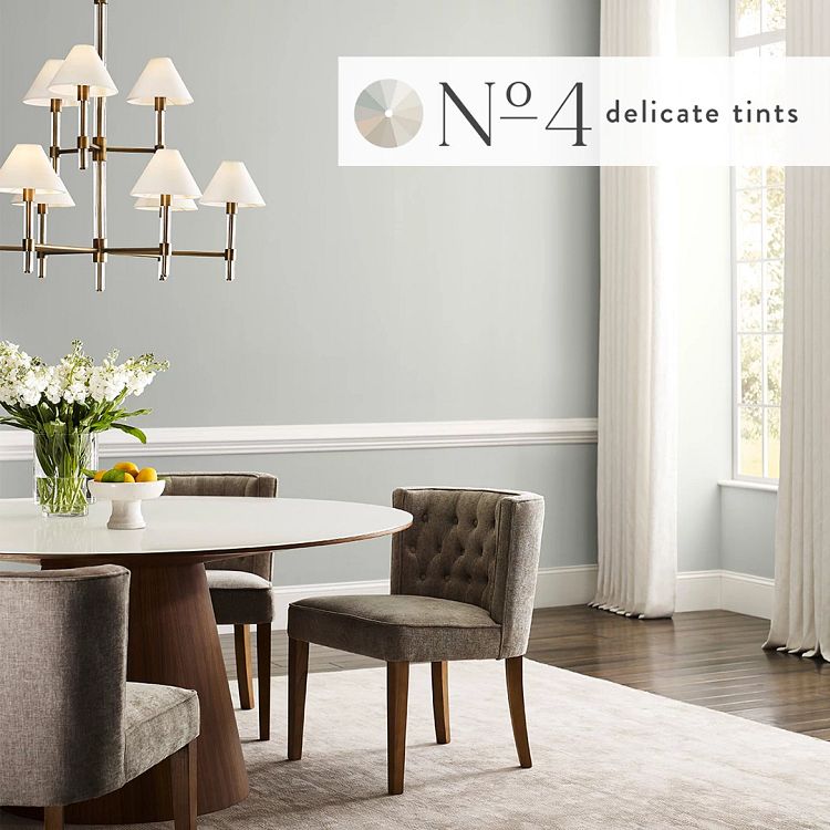
No. 4: A Study in Delicate Tints
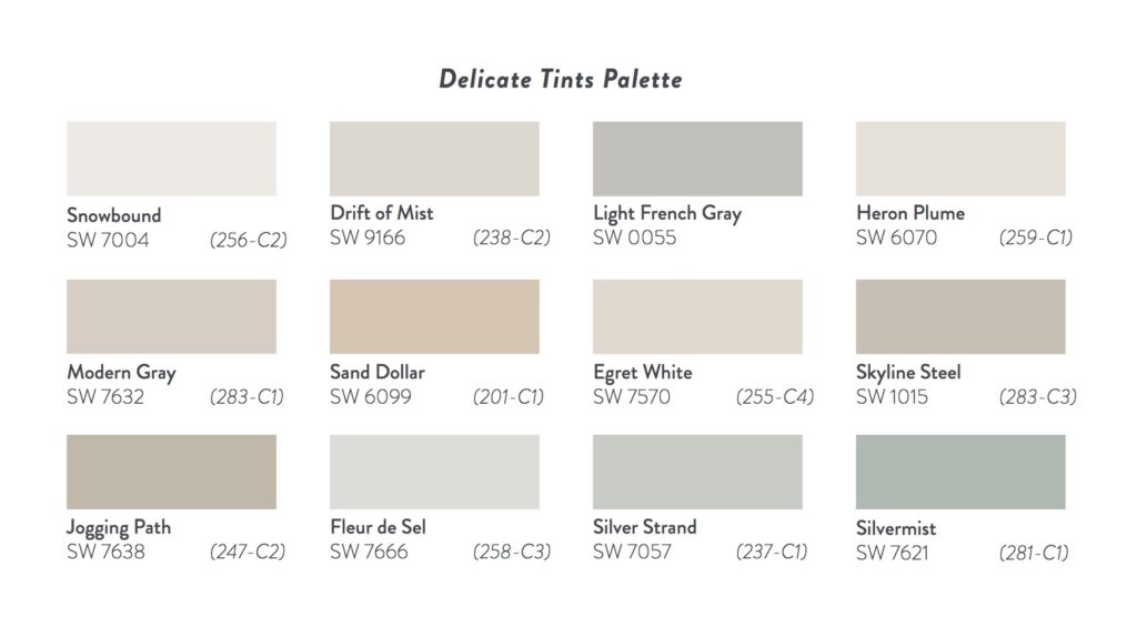
Neutrals and lighter shades prove as versatile as ever with the Delicate Tints palette. Snowy whites, modulated greys, and earthy browns can provide a powerful foundational backdrop. In workspaces, the visual simplicity of a lighter palette creates a sense of cleanliness, freshness, and new beginnings. Hotels can use delicate tints to set off premium materials like wood, marble, and statement lighting. And educational venues can profit from the literal and figurative “blank slate” of these lighter shades to create a harmonious atmosphere conducive to learning and helpful in establishing confidence.
Sherwin-Williams Colormix 2024 Anthology: Volume 1 is a valuable resource for designers. The palettes of Blues/Greens, Reds/Purples, Deeps and Darks, and Delicate Tints convey how color can work to achieve an intended effect. From enhancing the connection to nature, to energizing workers and fostering productivity, to creating immersive and memorable experiences, Colormix for Commercial Spaces offers a hand-selected, curated palette for the commercial designer aspiring to be on-trend in 2024. Says Sue Wadden, Sherwin-Williams Director of Color Marketing, “These color trends are poised to play a significant role in tomorrow’s designs. The leading shades of Anthology: Volume One are setting the color direction as we move into a new era of trend reporting.”

Learn more at Sherwin-Williams.
Related Posts


Popular Videos

Leave a Reply