David Rockwell is at it again: Swarovski, et. al. Jazz up the Oscars
I must admit I have sort of a fraught relationship with the Academy Awards. Increasingly disenchanted with Hollywood’s never-ending spate of lame sequels and soul-less TV show spinoffs, I find it incrementally difficult to encounter an “establishment” movie worth seeing. Even so, like a moth to the flame (or a Cubs fan to opening day), I tune in every year, hoping for some glimmer of hope for the prevailing cultural aesthetic, some sign that millennial Hollywood actually knows something about telling stories.
The 2010 Oscars. Set Design by David Rockwell.
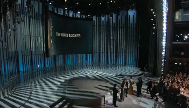
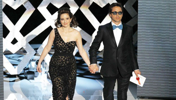
I’m pleased to say that this year’s show fulfilled that desire in spades: Martin and Baldwin were appropriately irreverent and alternately hilarious; winners were largely deserving (though I continue to lament Tarantino’s dearth of a directing Oscar); and Keanu Reeves got through his spiel without a single “you know.” As he introduced The Hurt Locker, Reeves–who, some 19 years back, starred in Best Director Kathryn Bigelow’s classic (if unintentionally hilarious) Point Break, achieved (as did much of the performers) the desired synthesis of high glitz and intimacy–a combination largely facilitated through David Rockwell’s innovative set design.
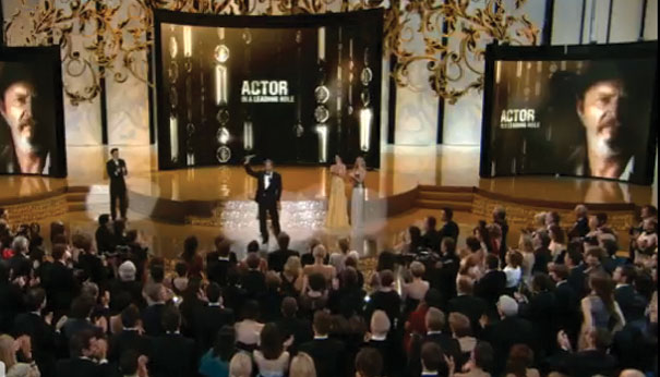
Readers will remember Rockwell from last year’s look at the Swarovski Crystal Curtain centerpiece, which made its debut in a glittering cascade of subdued slates, sapphires, and midnight blues. This year’s contribution was no less impressive: the very same curtain getting a curtain call for 2010, albeit in a revamped incarnation: constructed of 100,000 some crystals and weighing in at over 60,000 pounds, the new version features a gradation of translucent tones, “from clear crystal to a new topaz fringe, creating a sharper silhouette.” The new, lighter look is an attempt for a truer jibe with an L.A. aesthetic. Witness the clean white that dominated the stage set, evoking not only “abstract L.A. Modernism and the classic variety show,” but also enabling what Rockwell refers to as better “silhouetting,” making it a great room for setting off fabulous fashion and fabulous faces both (much like classic white dinnerware showcasing filet mignon, nothing shows off a tux like stark white).
Other of Rockwell’s innovations further emphasized the clean, light look. Complementary side curtains contributed to the sense of enclosure, while the enhanced use of reflective surfaces throughout the stage and auditorium (a “Venetian Blind” set piece as well as low walls studded with frosted mirrors) “multiplied” the sense of presence and import while advancing the transparent theme. Then there was the three-sided white cyclorama; made of 8-foot by 40-foot columns of stretched fabric, this clever covering brought an appropriate largeness to the set’s sense of scale–which was yet always tempered by the impromptu proscenium arch created by the curtain.
As elegant and intriguing as this all sounds, to my mind, some of these elements (especially the mirrors) run the risk of inducing vertigo from too much self exposure. But, then, that’s all in keeping with the “beautiful people on display” bent of the event. After all, these performers–from Martin, to winners Bullock and Bridges, to perennial favorites Clooney, Streep, and Mirren, to famed costume designer Sandy Powell, on to newcomers like Carey Mulligan–are our royalty. Rockwell’s careful combination of artful elegance and clever framing presented them as such, and made us feel like we were part of the conversation to boot.
Via Interior Design.

Leave a Reply