Graffiti for Books
Under the About Us section of his website, designer Charles Kalpakian states that part of his artistic philosophy is to “forget quotidian constraints.” This reminds me of a Donald Barthelme story, “Critique de la Vie Quotidienne,” wherein everyday life offers nothing but boredom (and a good amount of J&B). One might say that good design alleviates the sameness of everyday life, giving us something to surprise us into a newfound sense of feeling-Kalpakian’s Graffititek does just this.
Graffititek. Designed by Charles Kalpakian.
Inspired by Parisian graffiti, the bookcase eschews the straight lines of a standard bookshelf, instead offering a sort of imploded geometry, wherein books get to live askew and aslant. Titles become distorted, breathing new life into the oh-so-orderly world of the library. Certainly this is a bookcase for Kafka and Borges, both of whom wrote fantastical stories about labyrinthine libraries.
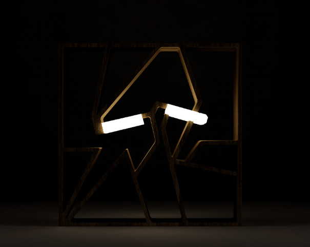
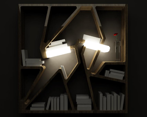
When lit, the Graffititek gives a metropolitan flare to its contents, like a passing subway train or highway car might do as it flashes past you. The light recalls city wall art, as graffiti is so often kinetic beneath streetlamps and traffic lights. There is something of the Futurist school in Kalpakian’s bookcase, with its emphasis on movement, geometry, and mechanophilia. If Edward Gorey and Tim Burton morphed into one being, then they would surely build a library completely of Graffititeks.
This is a new from 2008, but Kalpakian has other products that have received much attention and praise. His freeform Rainlight (also 2008) shares some of its tendril qualities with the Spaghetti Chandelier; and his Wave Chair from 2006 continues 3ring’s emphasis on the egg this week (see Egg Bed and Egg Chair).


Leave a Reply